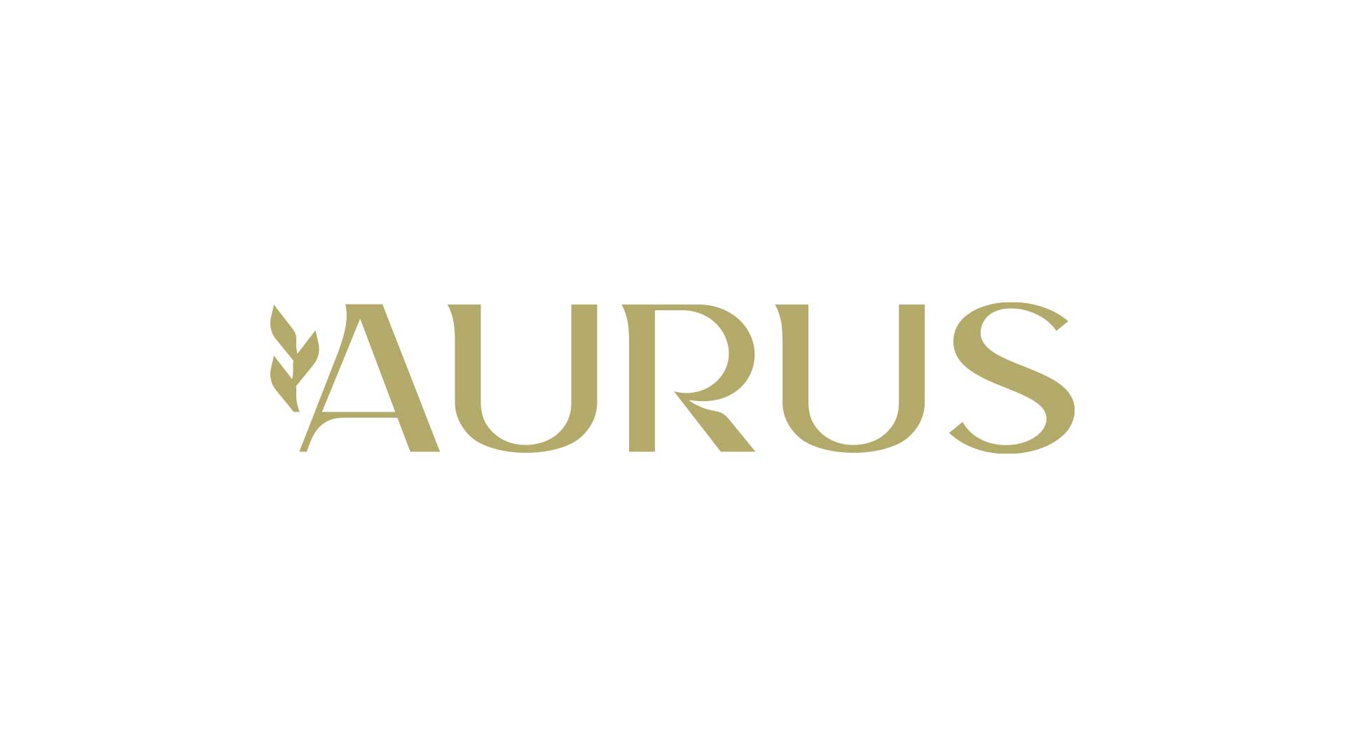
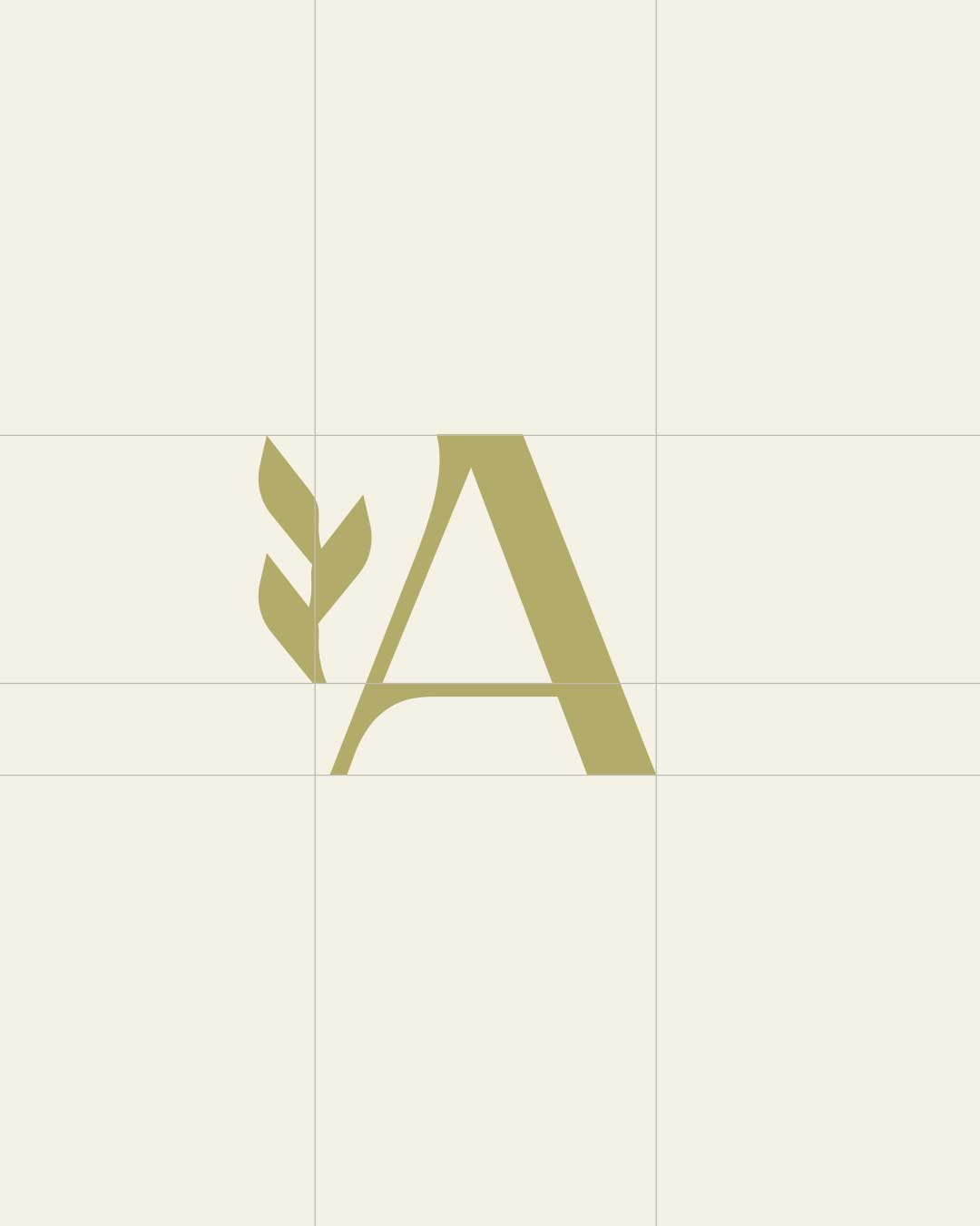
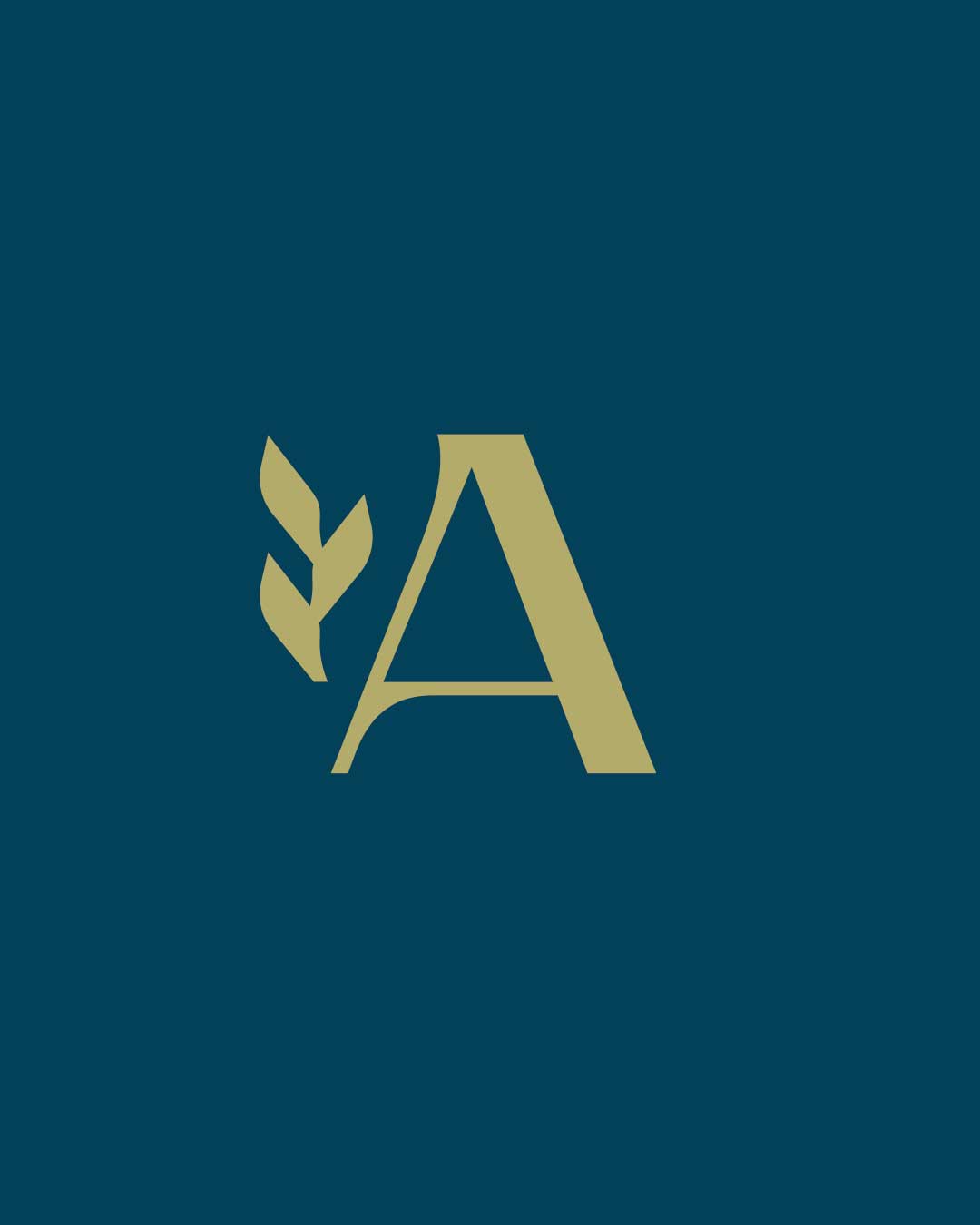
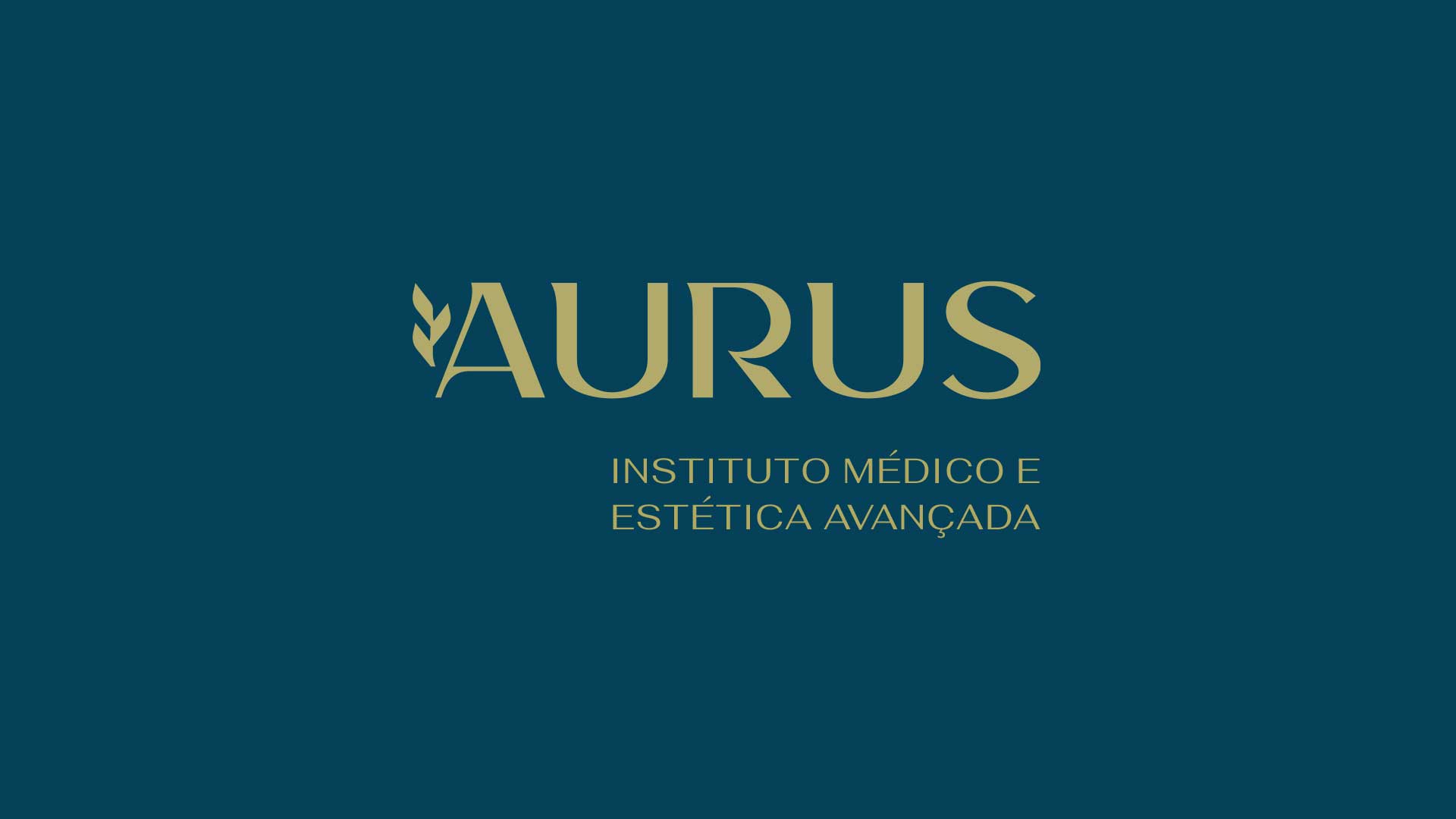
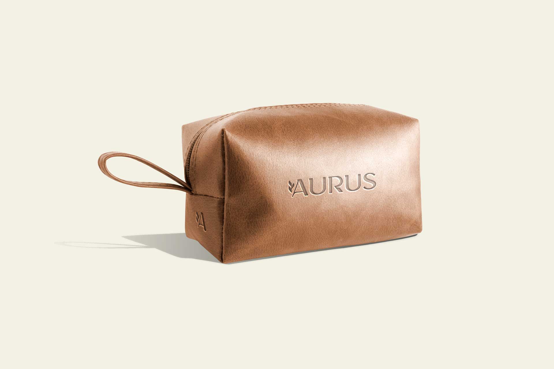
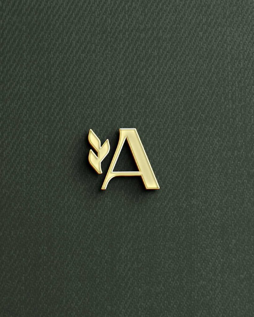
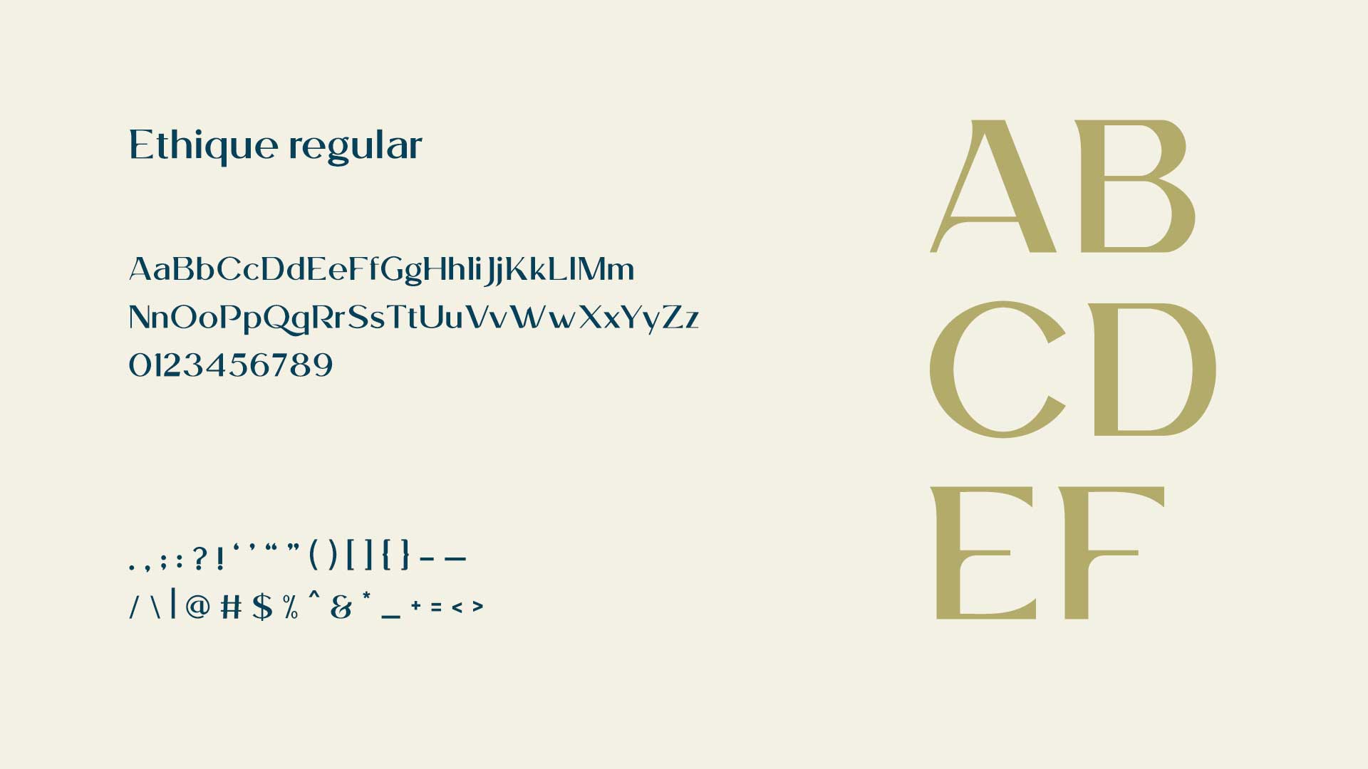
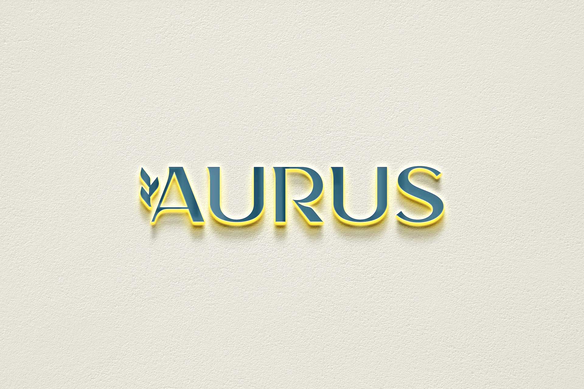
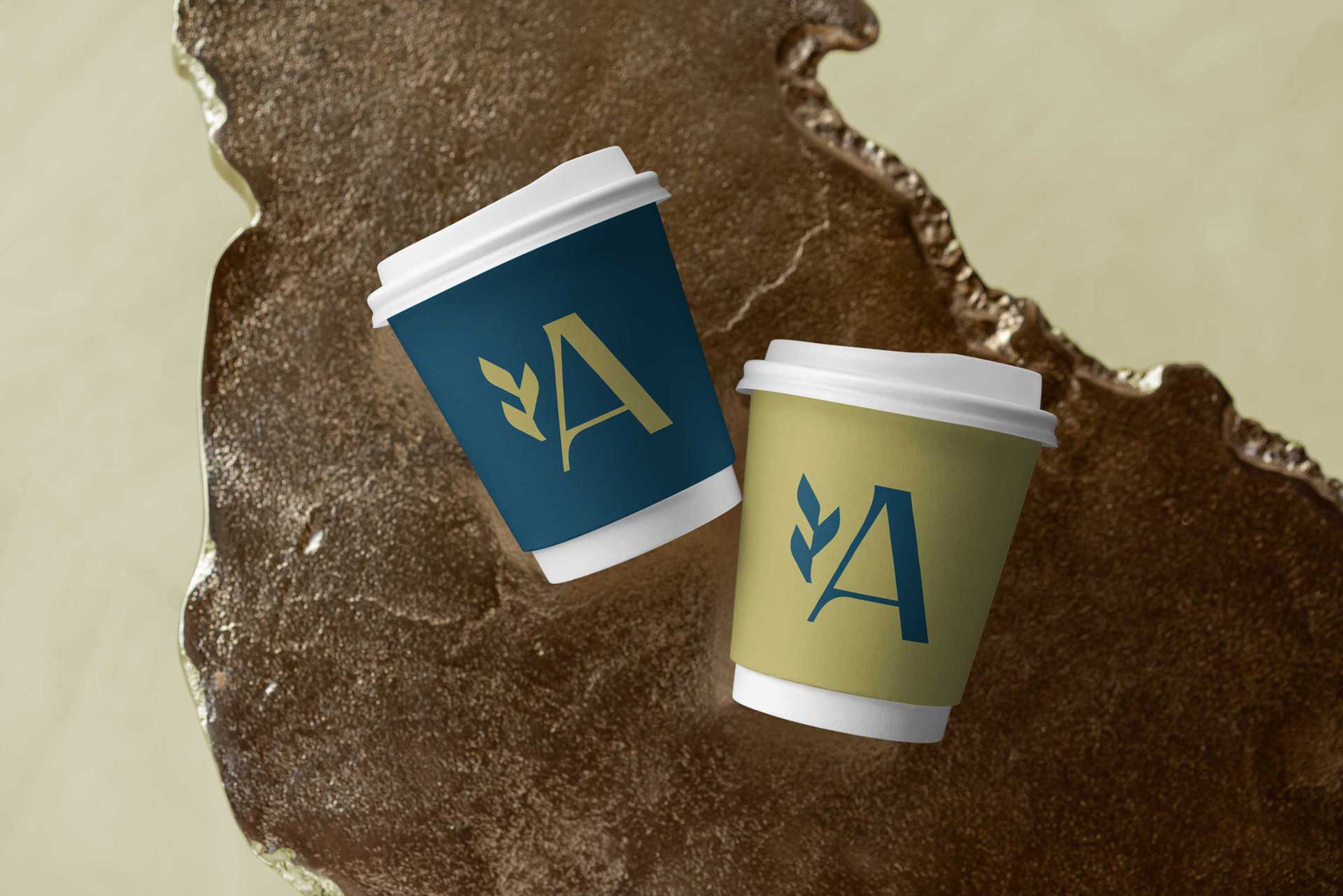
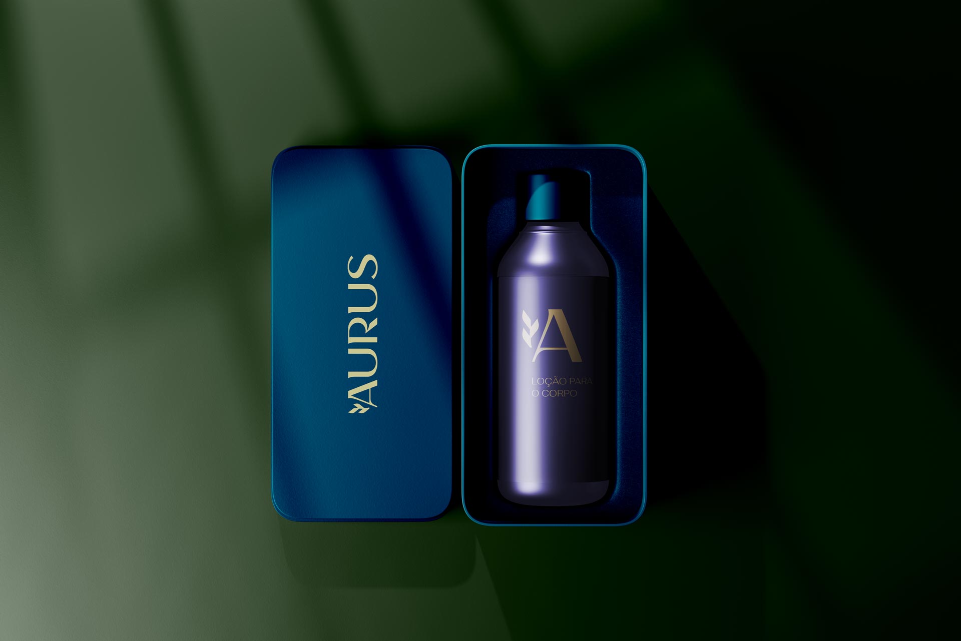
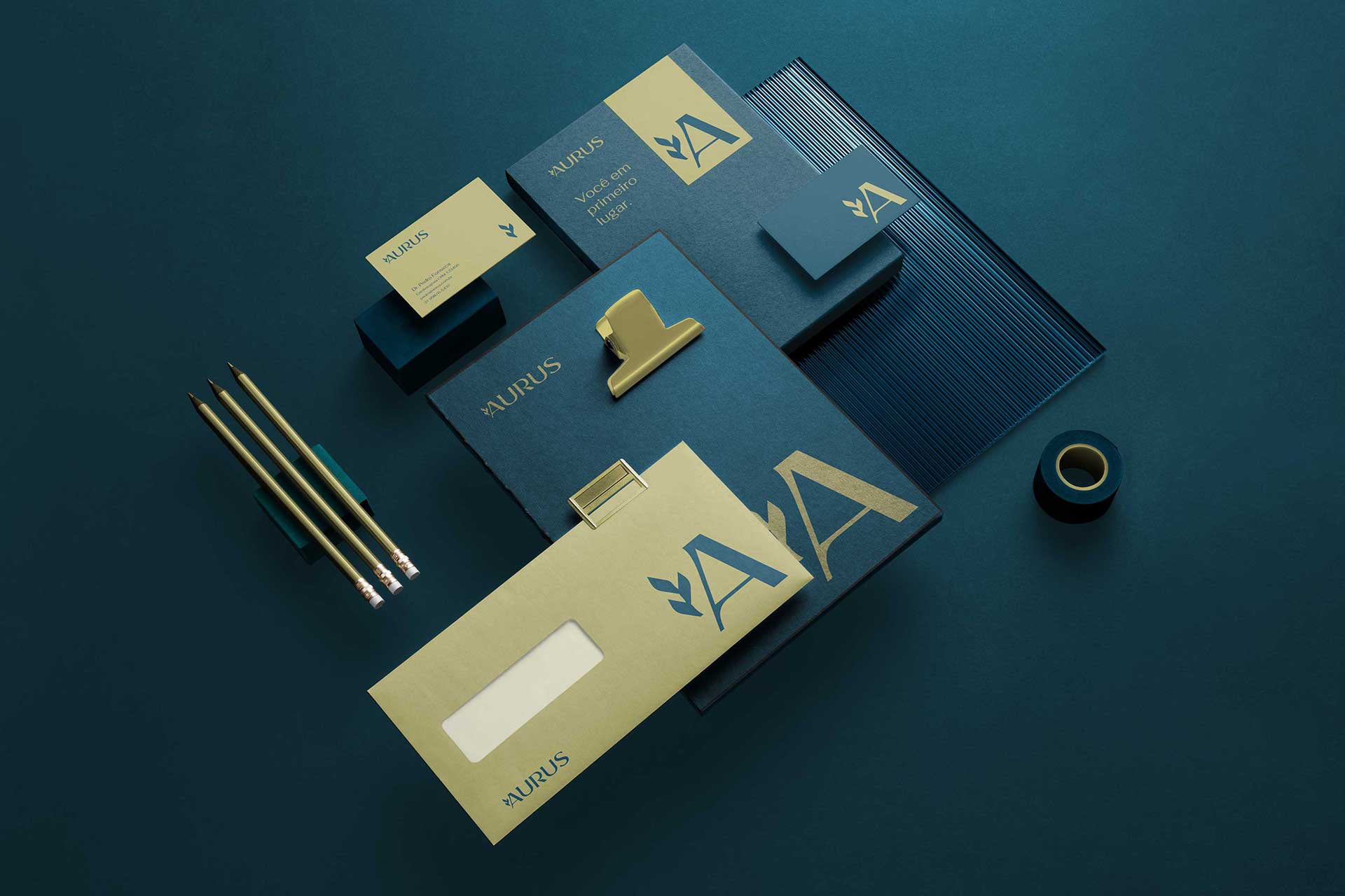
The Aurus Medical and Aesthetic Clinic brand is the epitome of excellence. The name originates from “Aurum,” which means gold in Latin. Visually, the identity features the letter A, a symbol of superior quality, fused with an olive branch, which represents recognition and references the city of Oliveira, where the clinic is located. The gold and blue color palette reinforces the concepts of luxury, health, and rejuvenation. The typography, minimalist and sophisticated, balances the classic and the modern, conveying elegance and timelessness. The entire visual system expresses Aurus’ core purpose: to offer high-end services with a focus on well-being, quality, and prestige.
Naming, visual identity, signage, and web design
Oliveira, Minas Gerais
Client: Aurus
Creative direction, design, and project management: Marcos Medeiros Signage execution and installation: Inspirativa