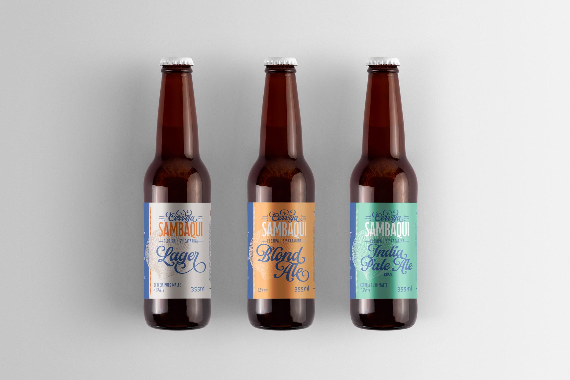
Introducing the new identity of Cerveja Sambaqui! A pioneering brand since 2013, now with a refreshed look and even more connected to its maritime essence. The iconic shell has been redesigned with new details and proportions, reinforcing its inspiration from the sea. The color palette has evolved into a lighter blue and a vibrant orange, evoking energy, sunshine, and sand. The typography now delivers greater impact and movement, with improved legibility. The new tagline “Live in Harmony” reflects the brand’s purpose: to promote culture, gastronomy, and the conscious enjoyment of high-quality craft beer. Cheers!
Visual identity, packaging, signage, social media, and promotional design project.
Florianópolis, Santa Catarina
Client: Cerveja Sambaqui
Creative direction, design, and project management Marcos Medeiros