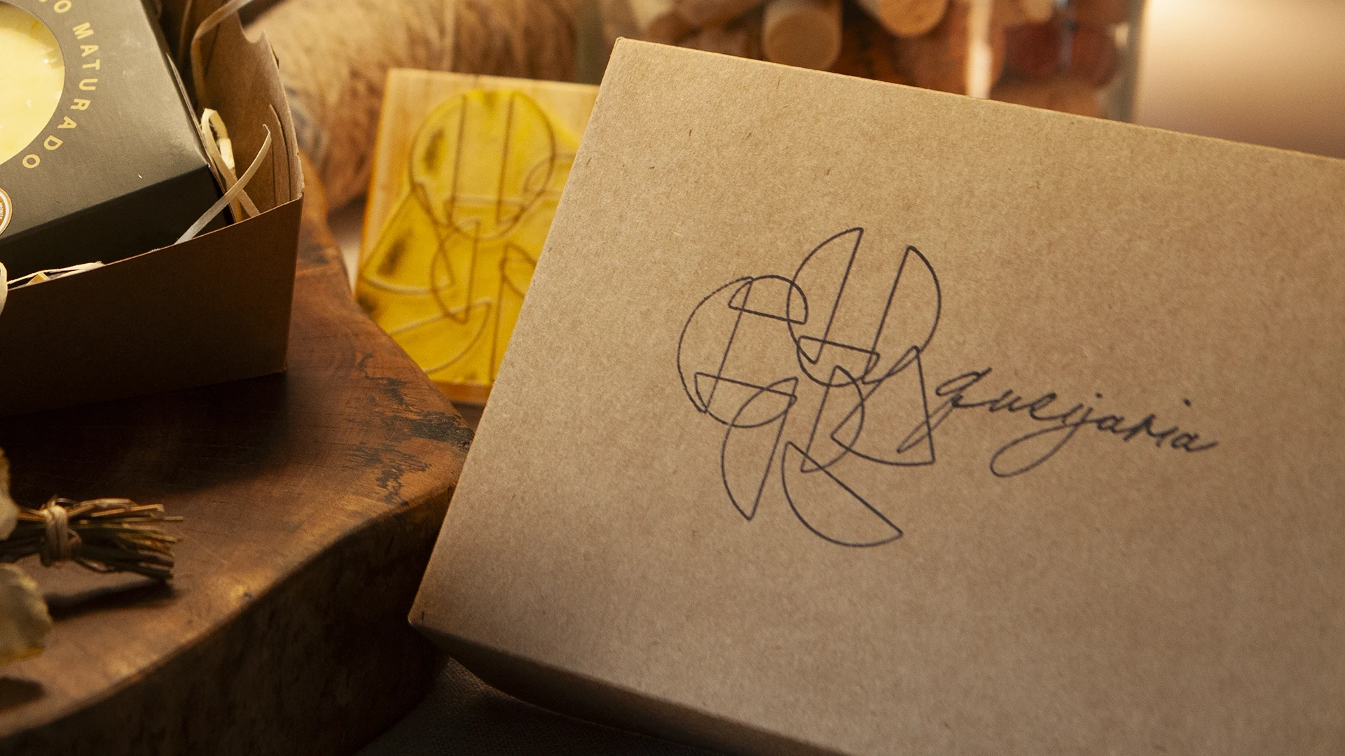
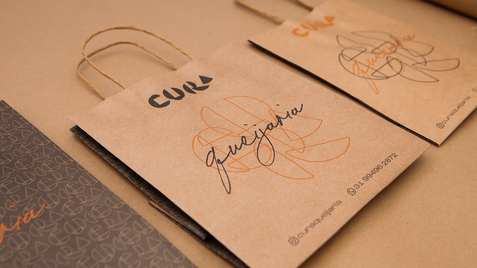
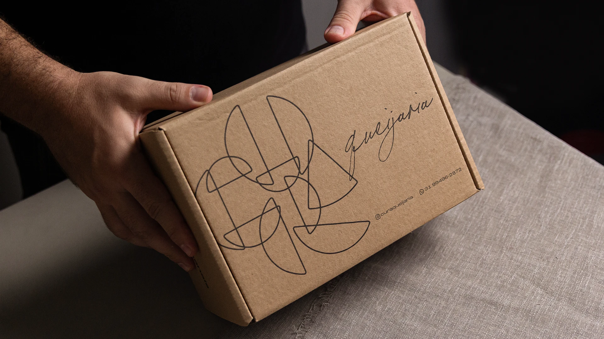
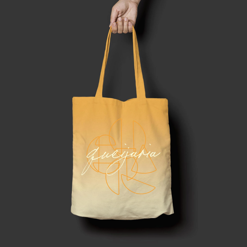
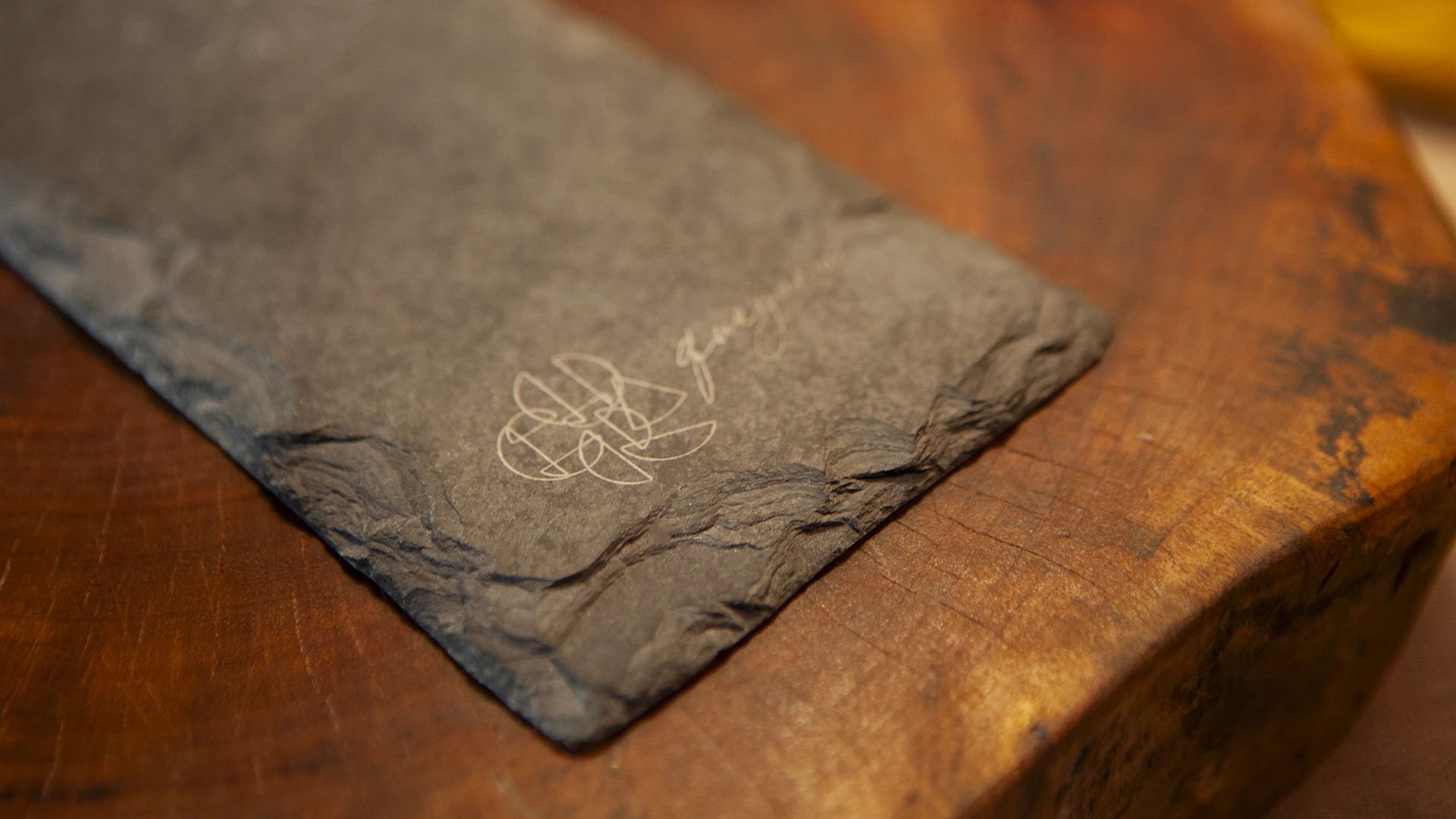
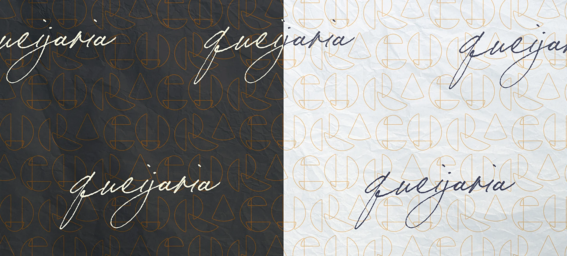
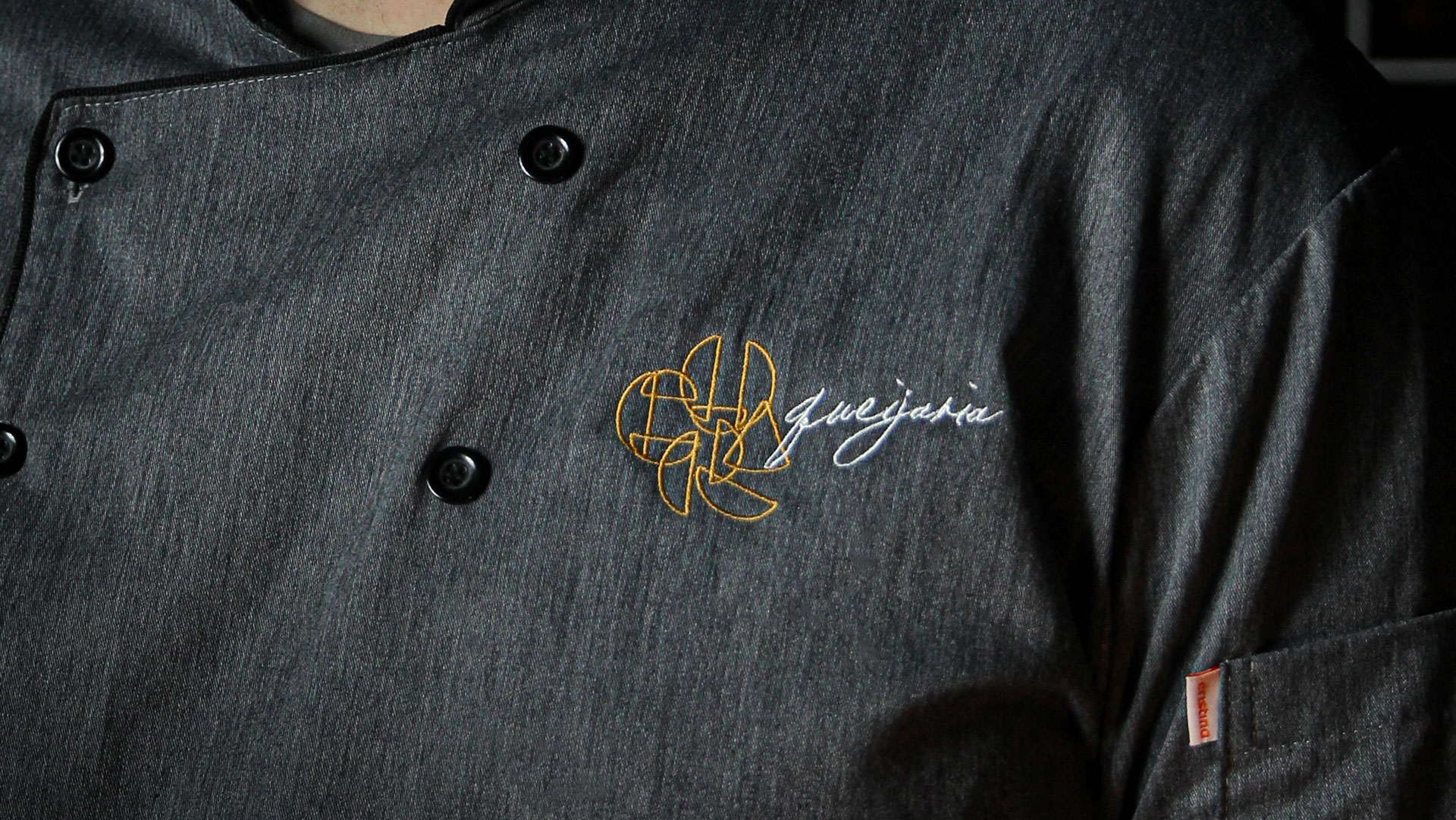
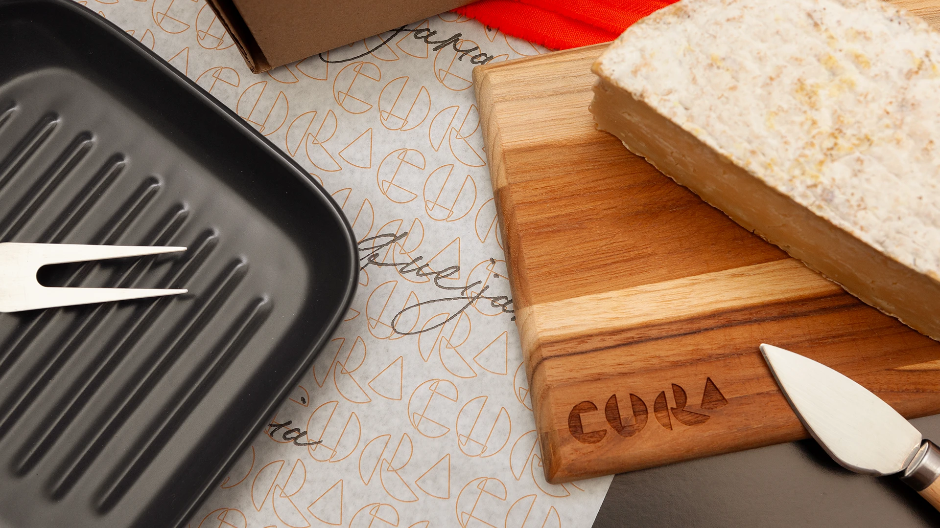
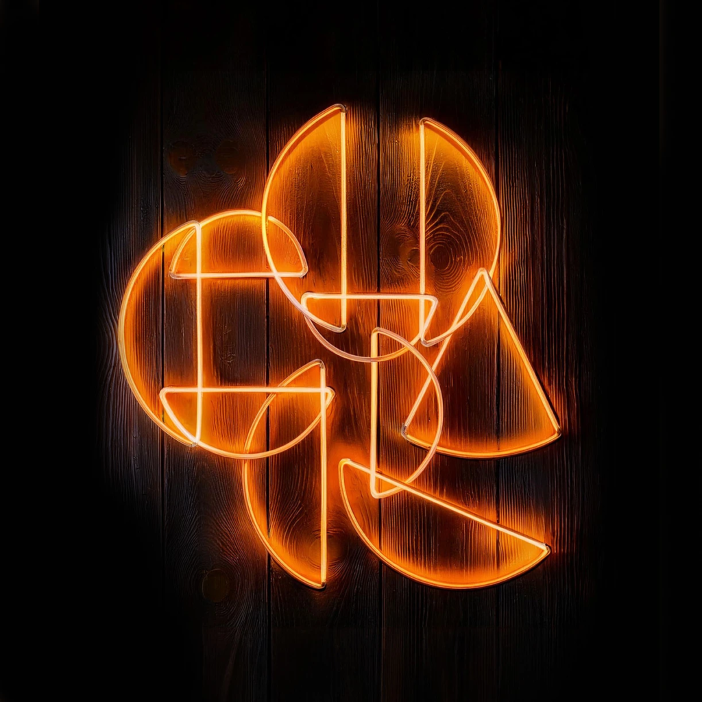
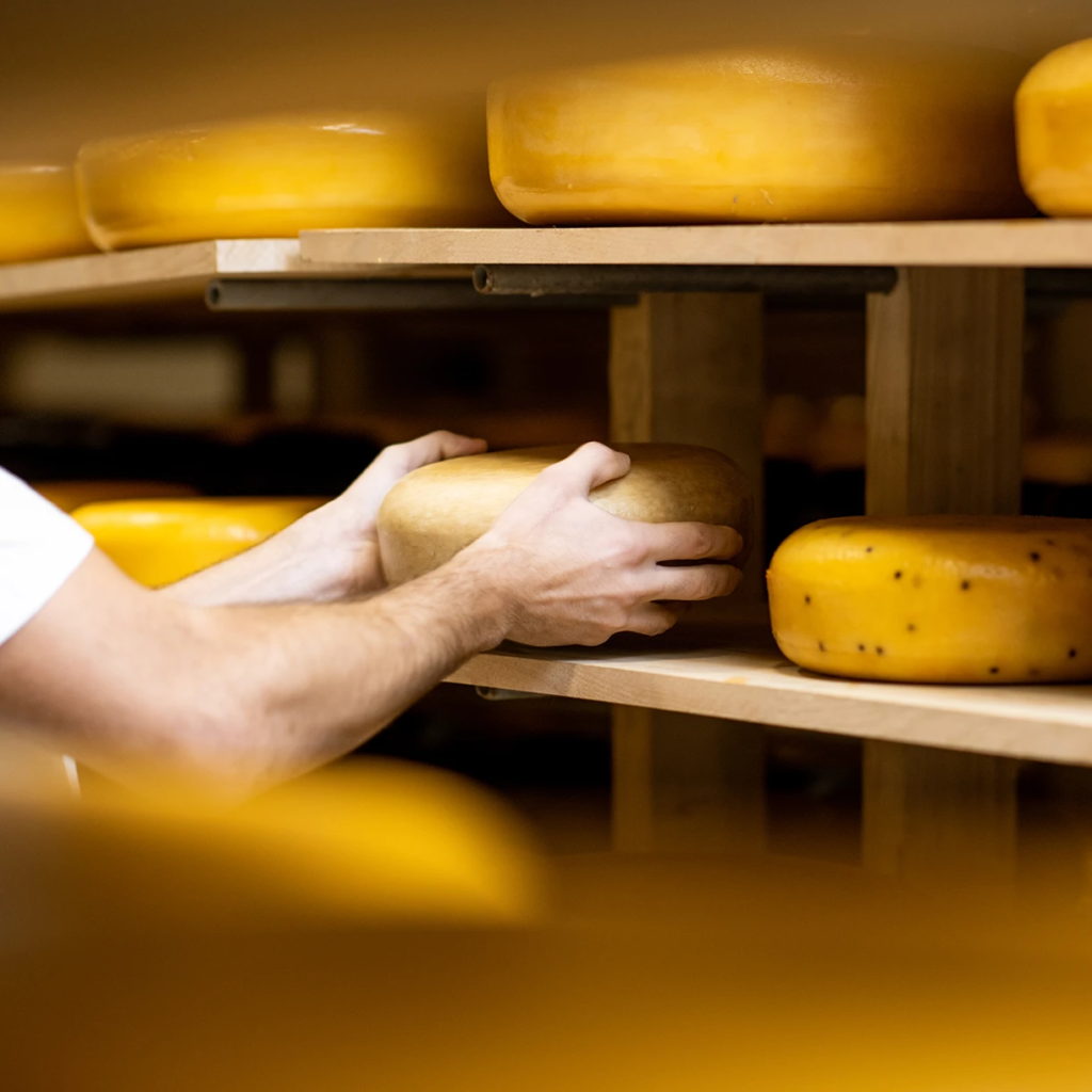
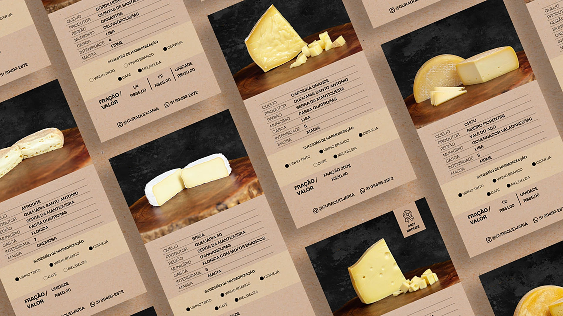
With a contemporary and disruptive language, the brand is typographically built upon the representation of cheese fractions, in a friendly play that evokes the diversity of flavors and sizes of this delicacy. This also conveys good moments of gathering when the product is served at the table. The color palette symbolizes the maturation process, ranging from pastel to vibrant yellows, where the aging process can be visually savored.
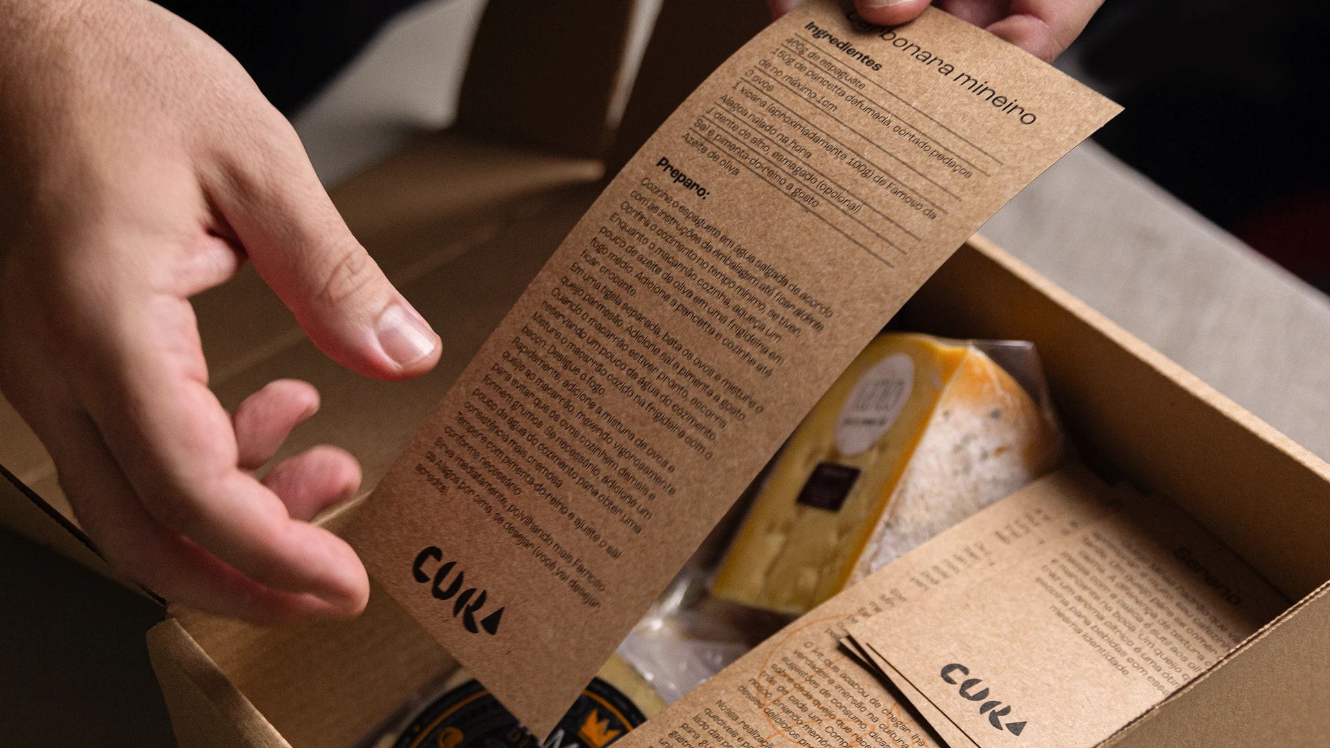
Visual identity, packaging, signage, editorial, photography, and video
Belo Horizonte, Minas Gerais
Client: Cura Queijaria
Creative direction, design, and project management Marcos Medeiros