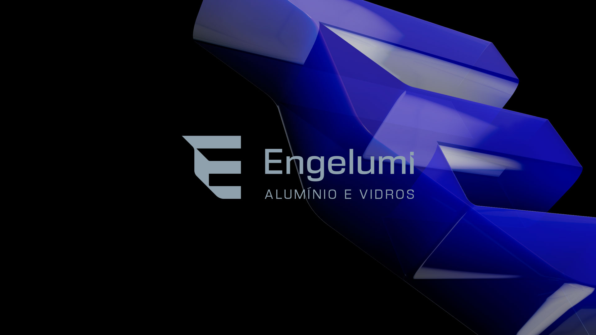
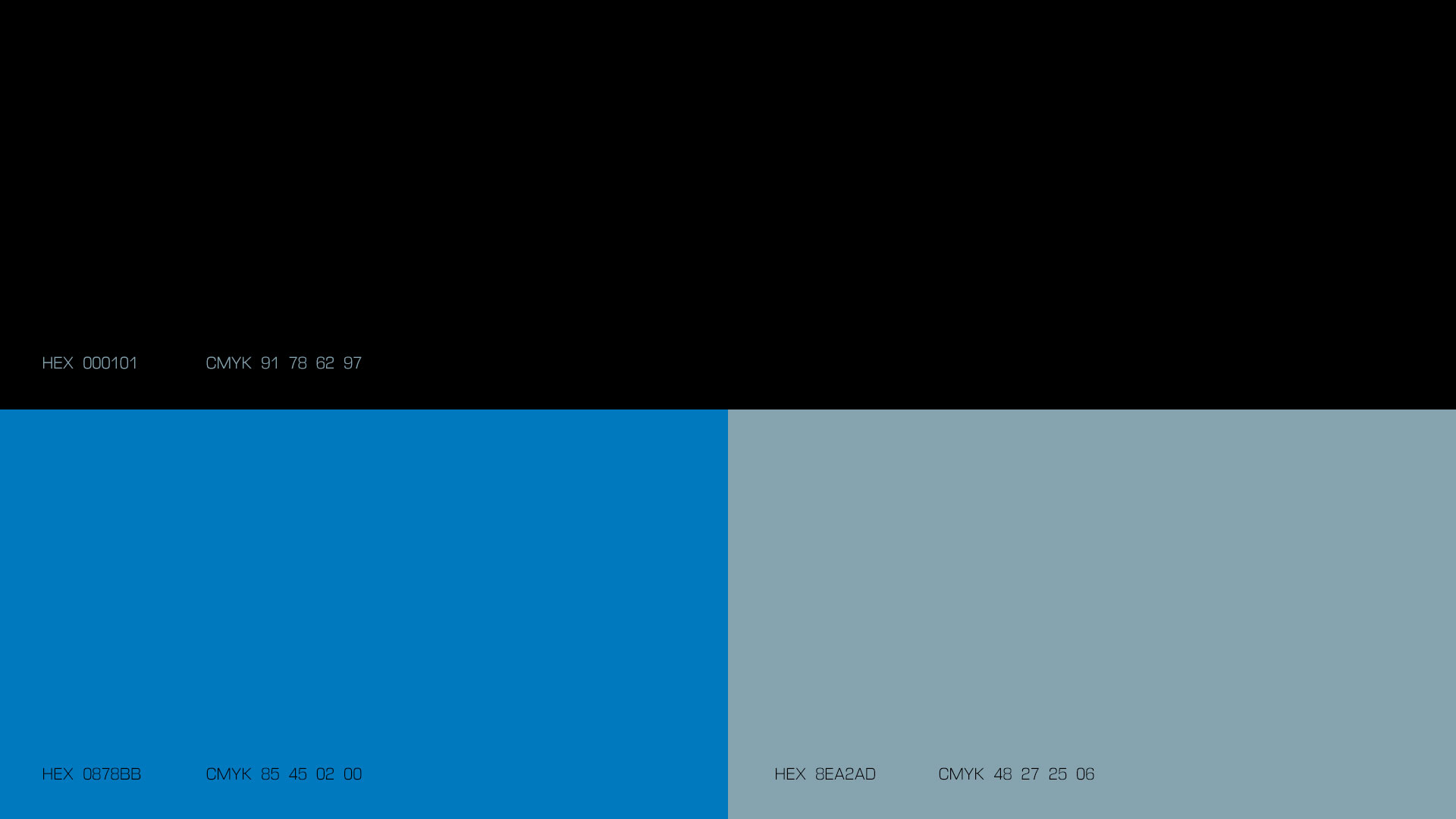
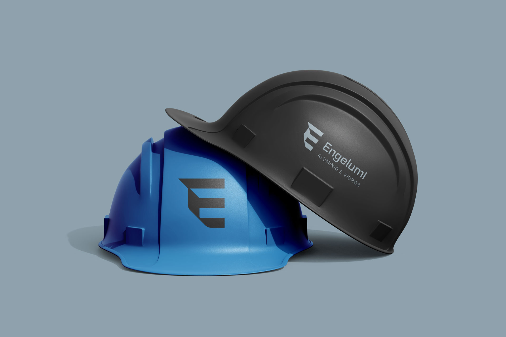
With a precise and contemporary visual language, the Engelumi brand is built around the letter “E”, explored as a symbol of profiles, structures, and perspectives, elements that directly reference the technical universe and the versatility of aluminum. This graphic representation reinforces the strength and constructive intelligence of the products while also suggesting innovation and technological capability. The color palette combines blue and bluish-gray tones, evoking reliability, stability, and industrial sophistication, key attributes for the brand’s role in both residential and corporate projects.
Visual identity project with applications in stationery, signage, uniforms, promotional materials, advertisements, products, and social media
Florianópolis, Santa Catarina
Client: Engelumi
Creative direction, design, and project management Marcos Medeiros