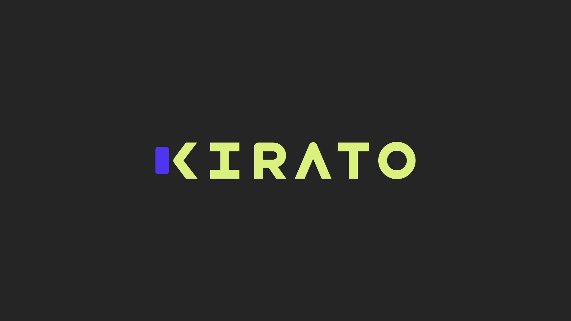
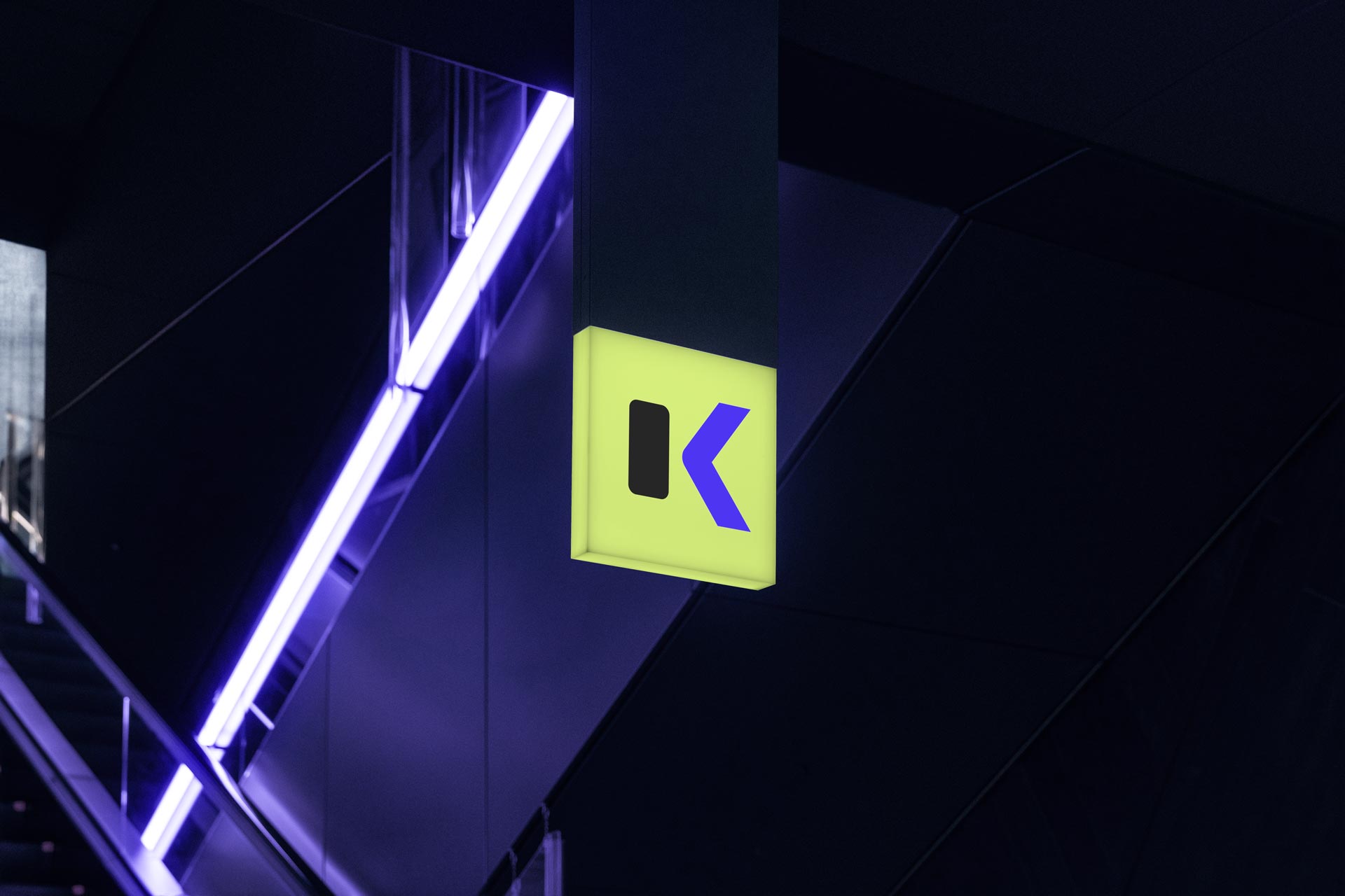
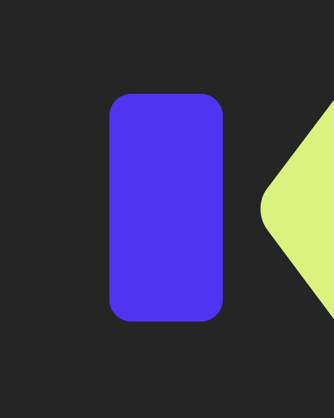
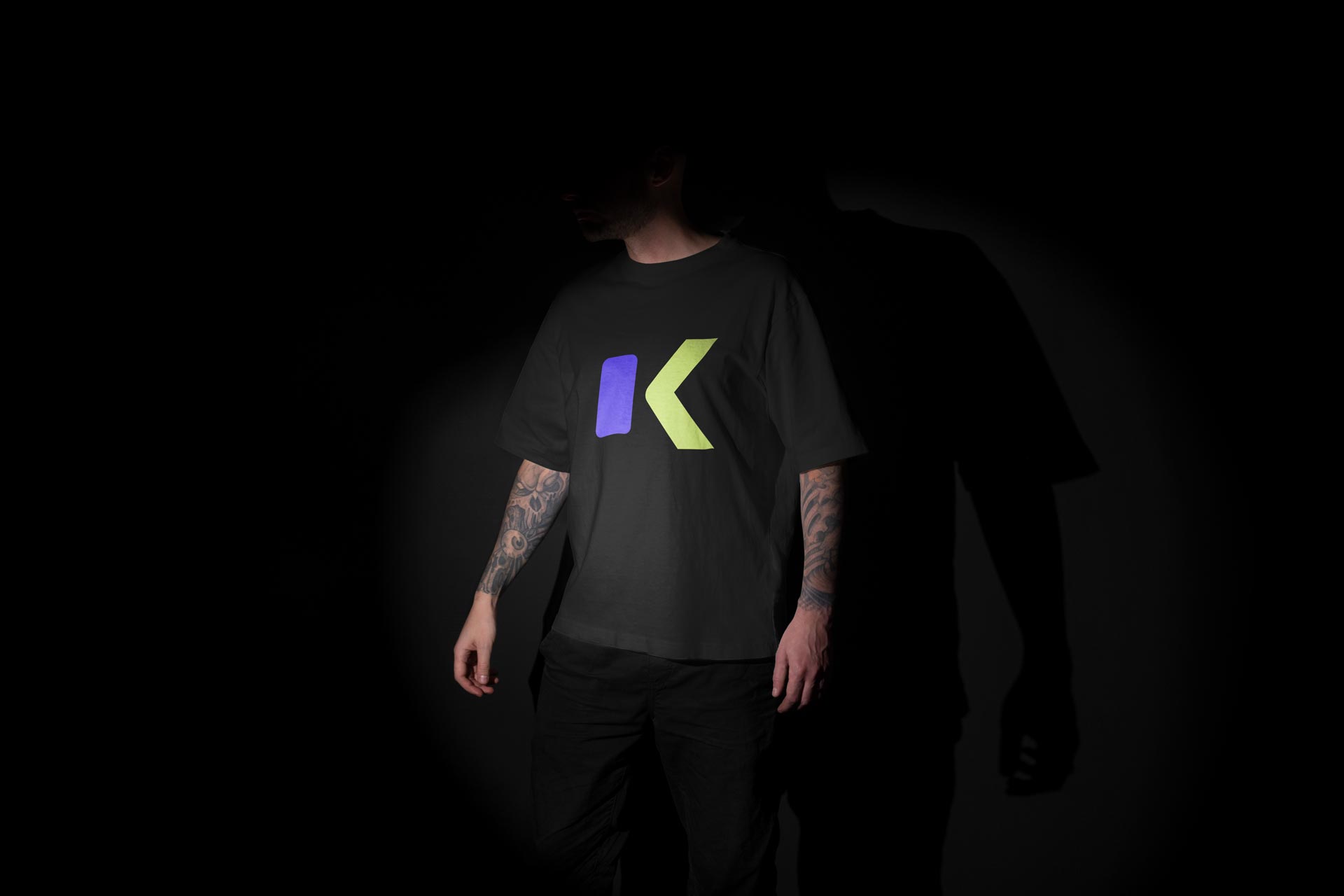
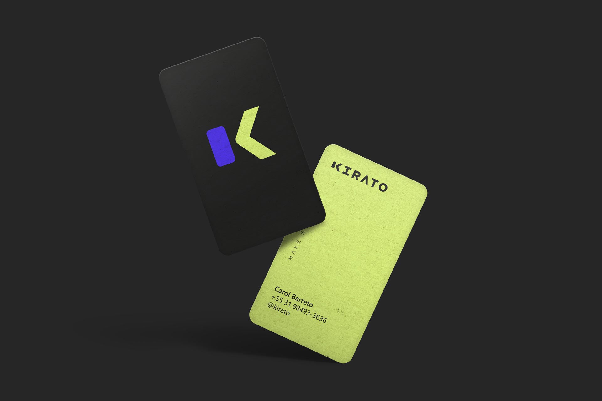
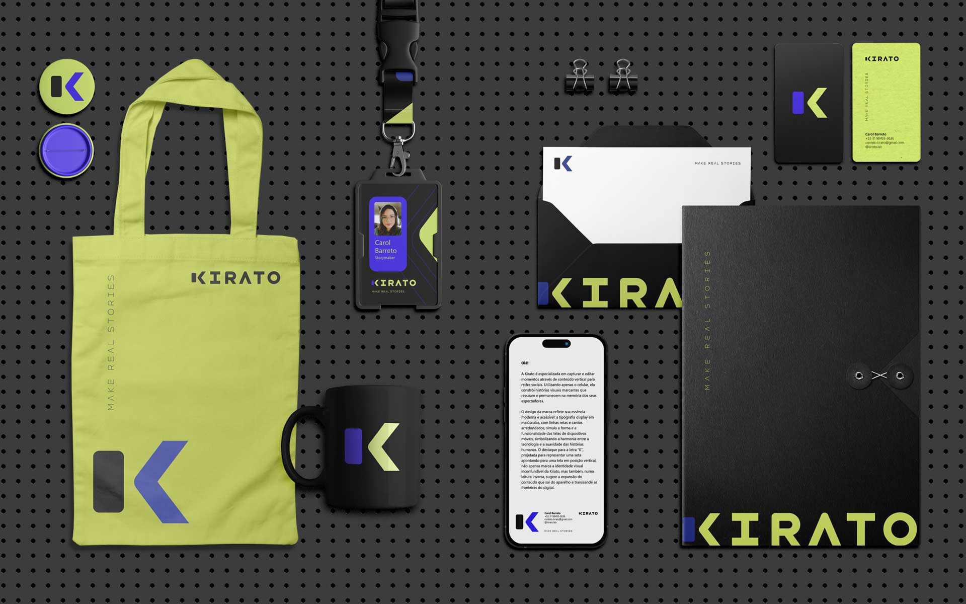
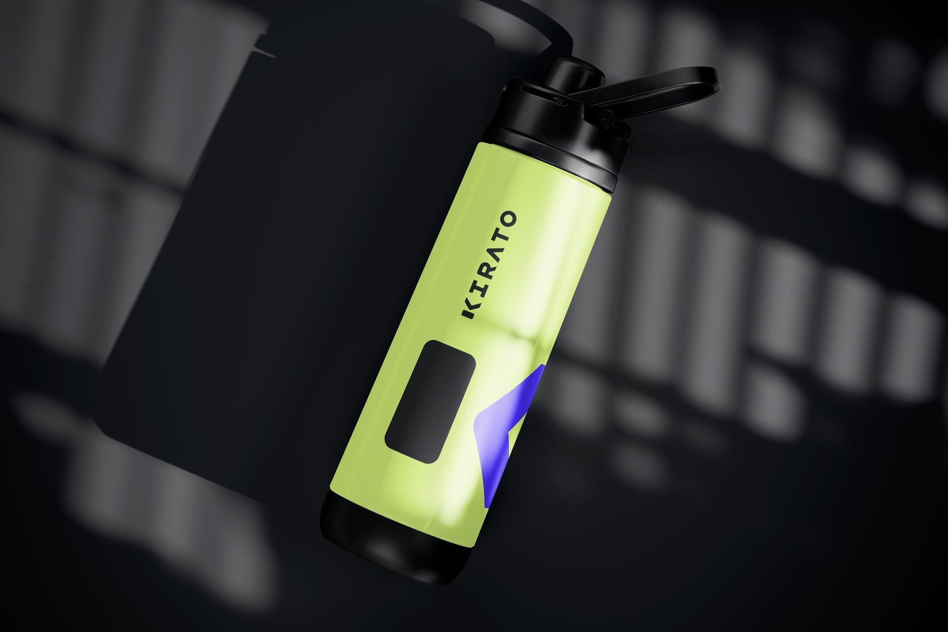
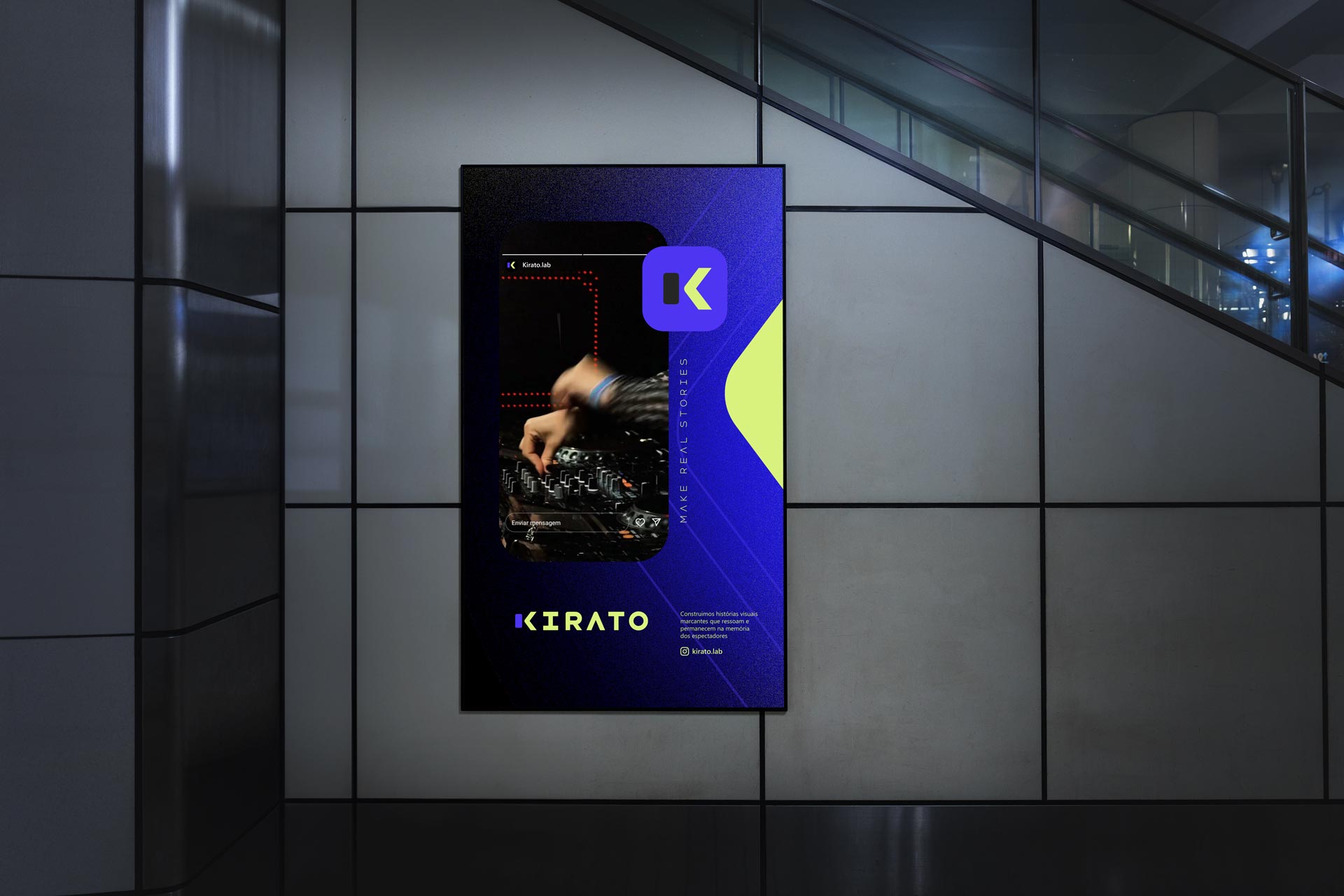
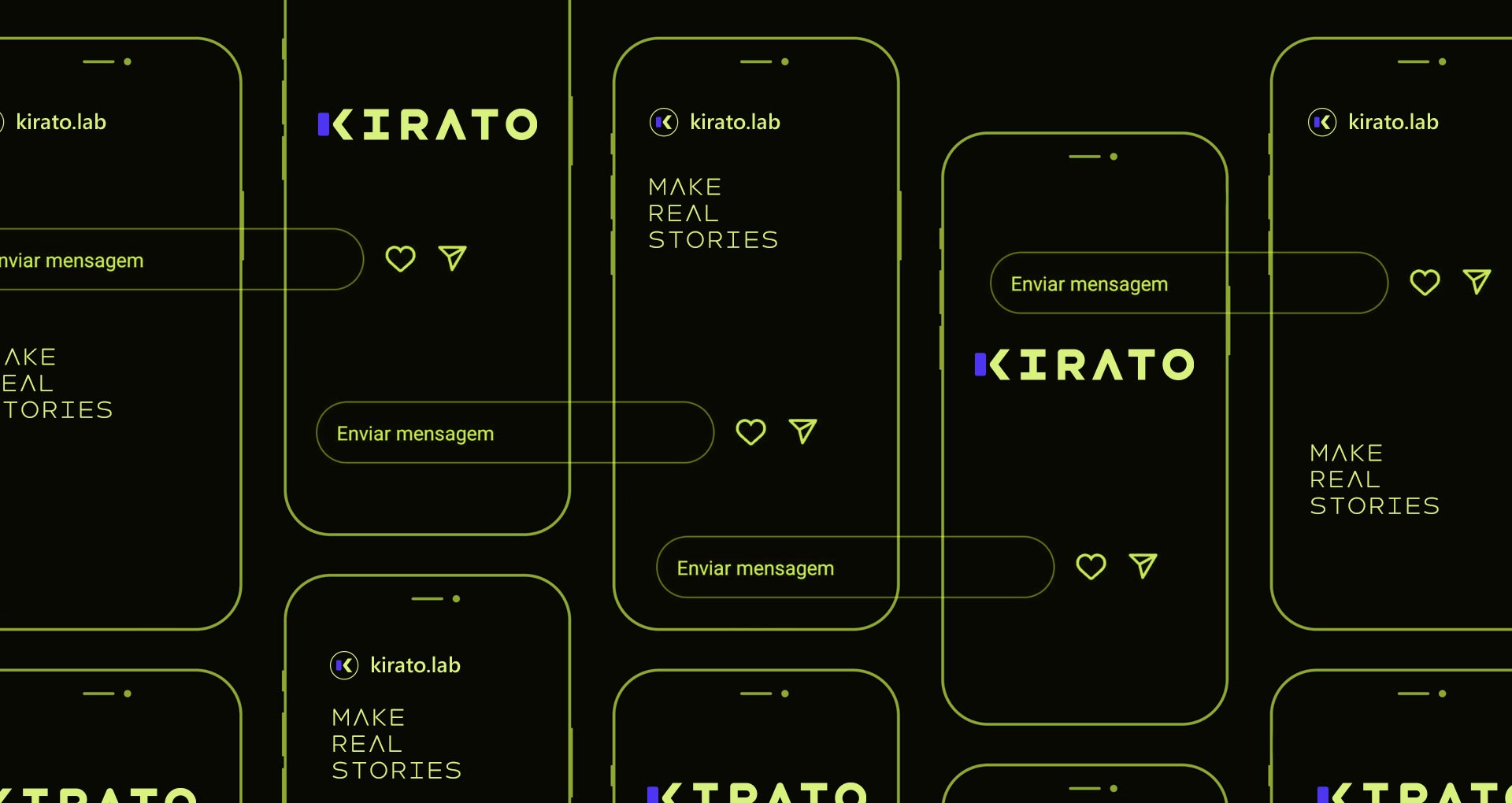
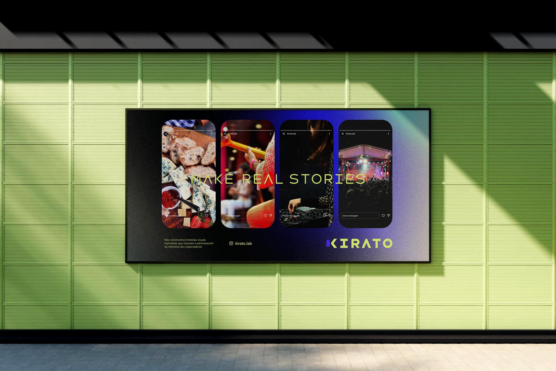
Kirato specializes in capturing and editing moments in vertical format for social media. Using only a cell phone, it transforms everyday scenes into striking visual stories that connect and remain in memory. The brand design translates this modern and accessible essence: uppercase typography, with straight lines and rounded corners, referencing the shape of mobile device screens. The highlight is the letter K, designed as an arrow pointing to a vertical screen, also symbolizing expansion, direction, and the force of content that transcends digital borders.
Visual identity
Belo Horizonte, Minas Gerais
Client: Kirato
Creative direction, design, and project management Marcos Medeiros