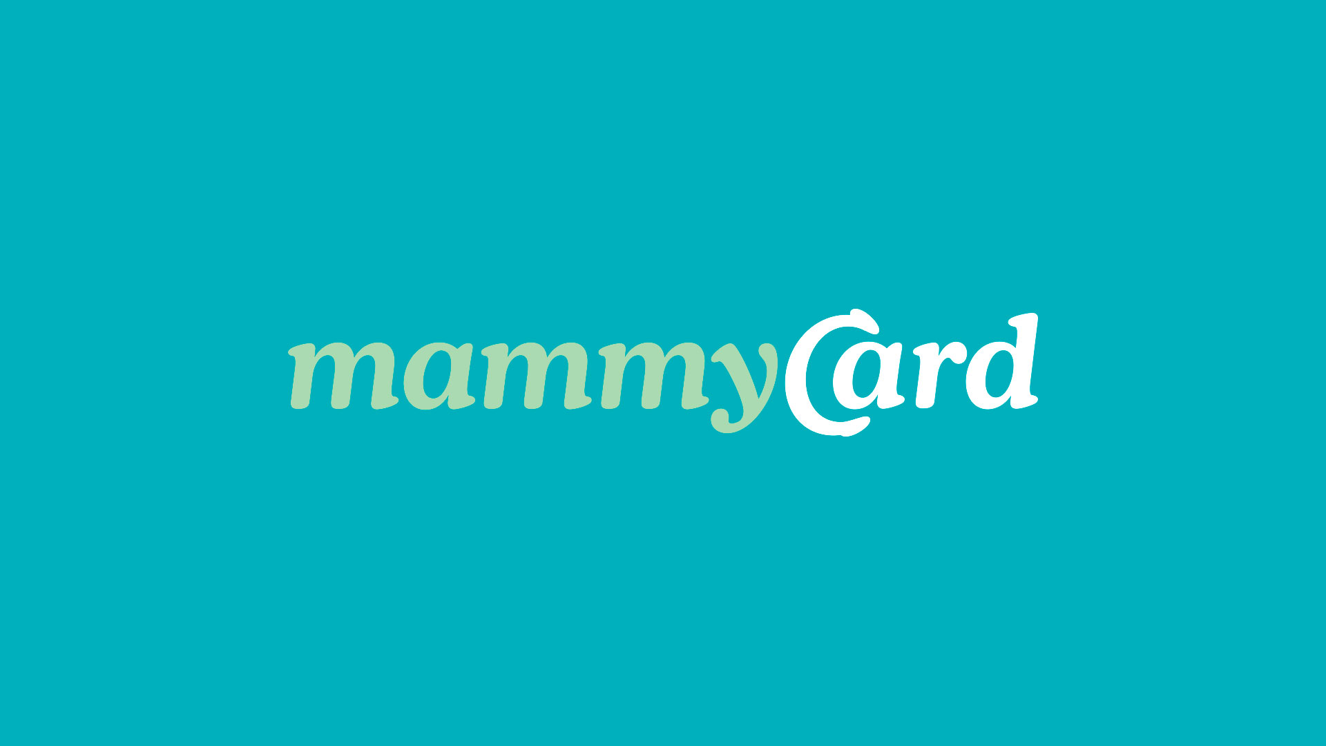
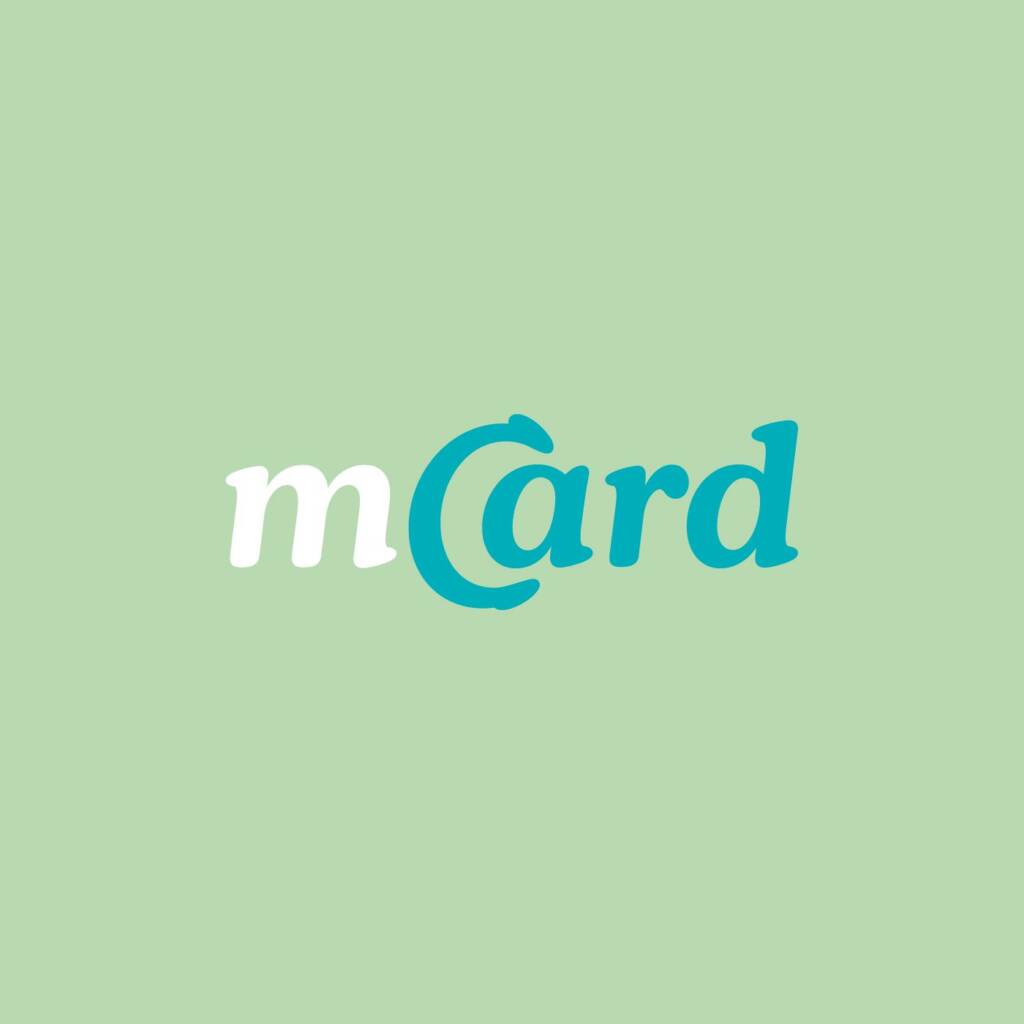
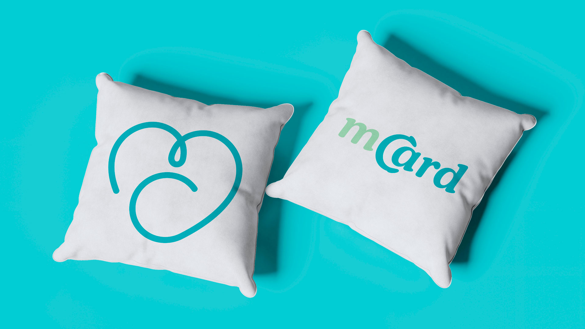
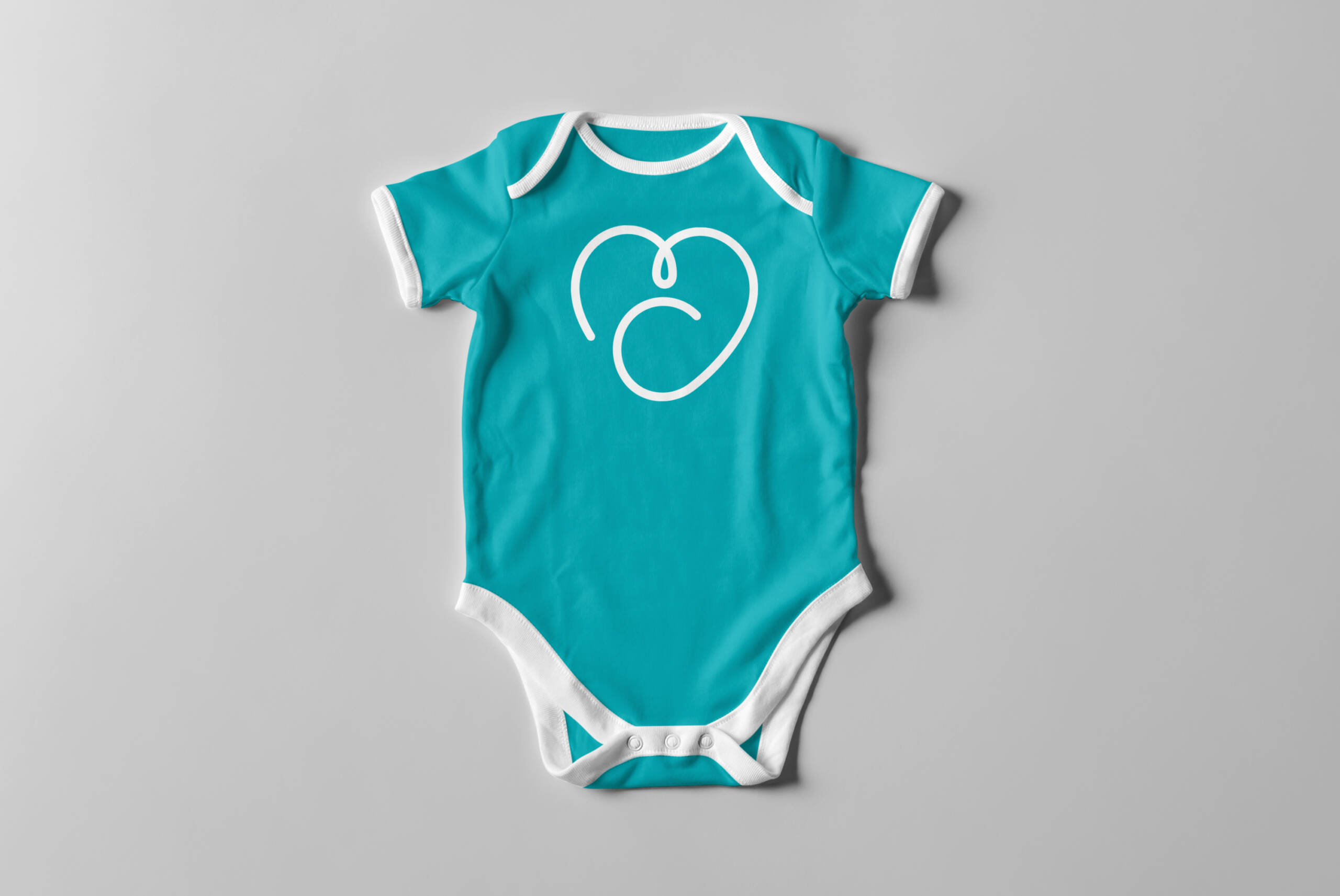
The brand stands out for its authenticity and sophistication, connecting uniquely with doctors and expectant mothers. The typographic interlock between the letters “C” and “A” subtly evokes the theme of pregnancy, making the brand clear, memorable, and modern. The symbol, created with a continuous line, integrates the letters M and C in the shape of a heart, representing the affective connection of gestation. It also delicately suggests the image of a baby with an umbilical cord. Versatile and emotional, the symbol can be used independently, reinforcing the visual identity with lightness, empathy, and language aligned with the digital and prenatal health universe.
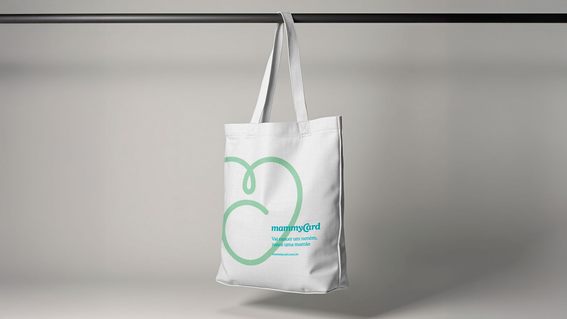
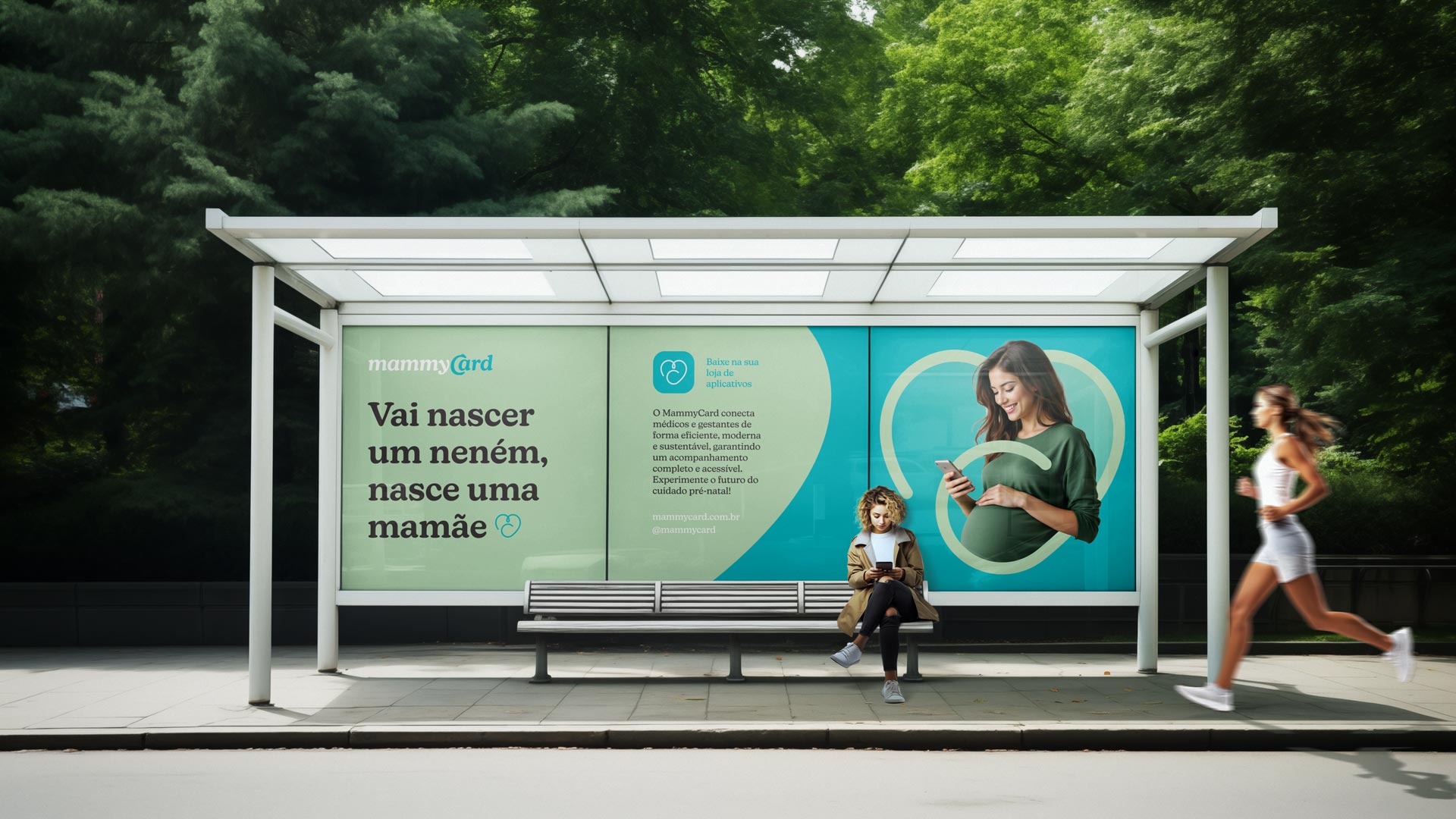
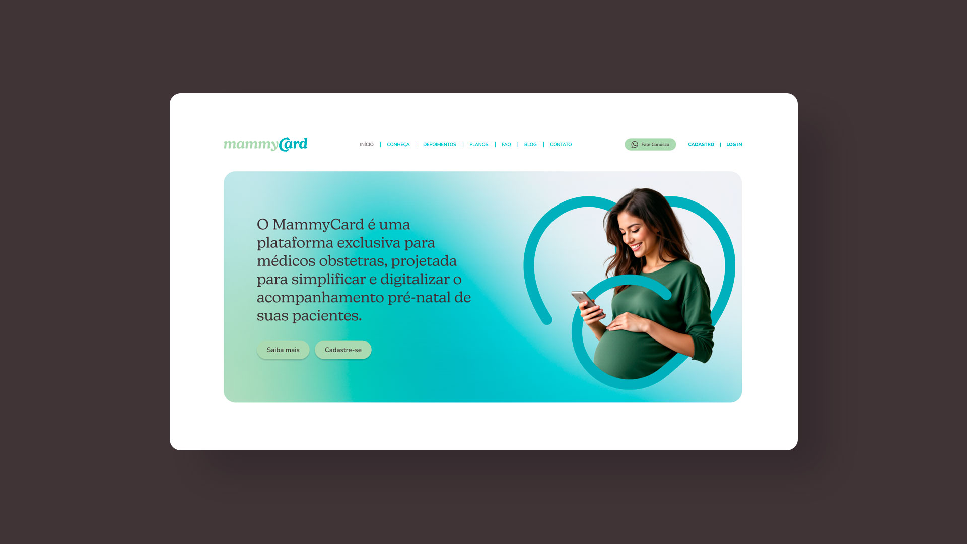
Visual identity, interface design, and applications for promotional materials and advertisements
Belo Horizonte, Minas Gerais
Client: MammyCard
Creative direction, design, and project management Marcos Medeiros UX e UI Marcos Medeiros e Luis Paulo Lohmann