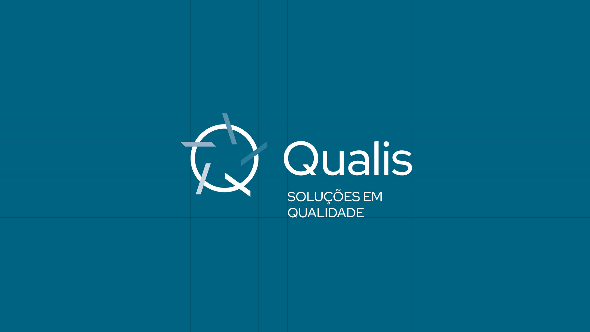
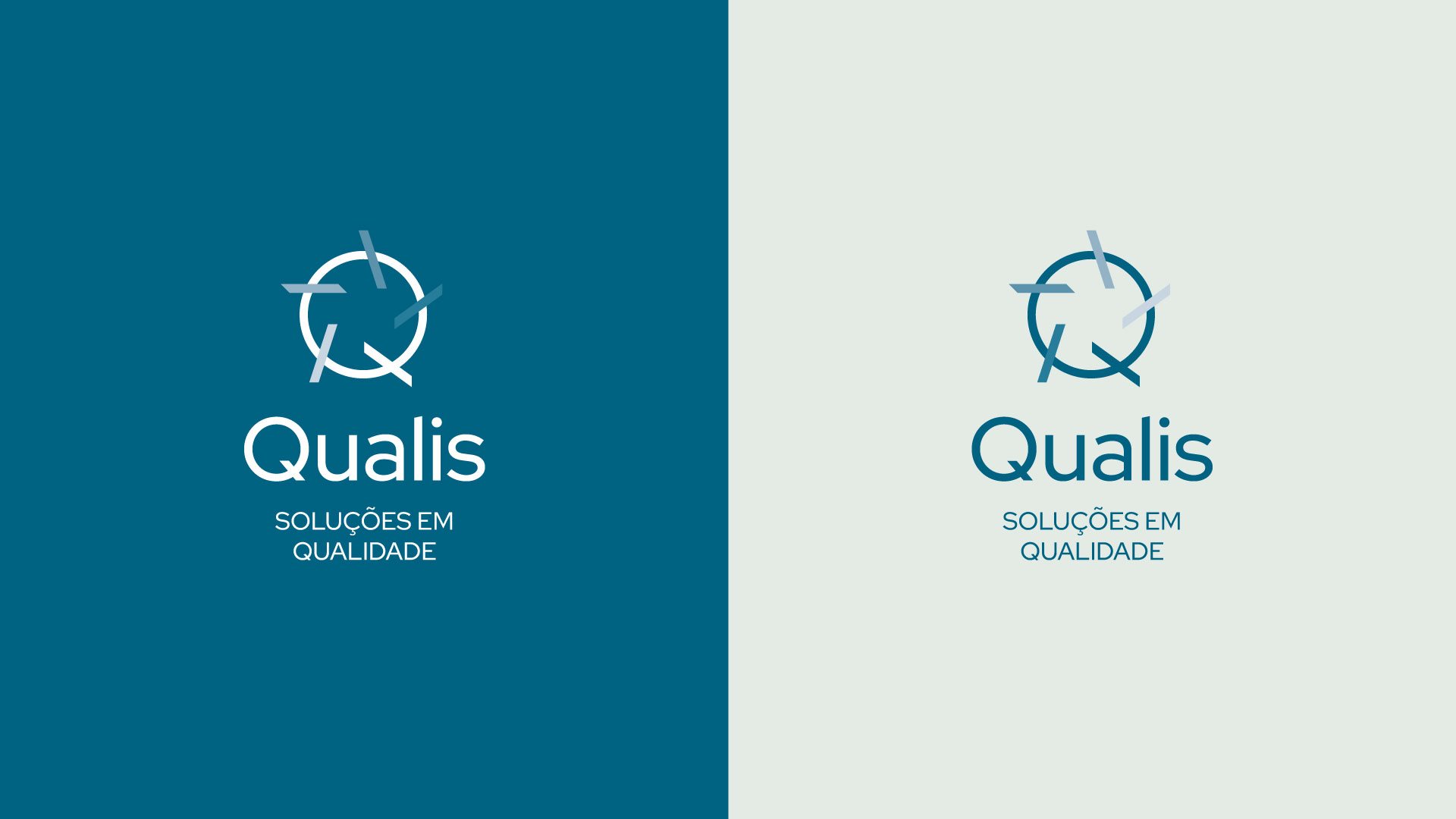
With symbolic and strategic visual language, the Qualis brand is built from the overlapping of star-shaped lines over a circle, uniquely forming the letter “Q”. This composition directly reflects the company’s commitment to management and the improvement of processes and results, which is the essence of its work. The star represents the pursuit of excellence, while the circle reinforces the idea of continuity, procedures, and integration. The color palette evokes sustainability, efficiency, and balance, key attributes for a brand positioned as a partner in quality solutions
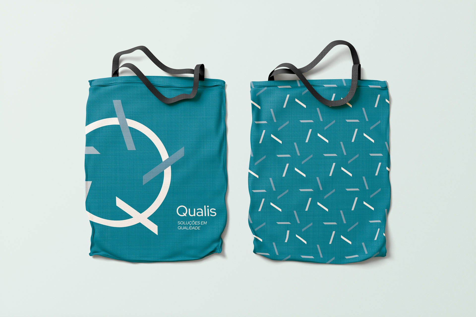
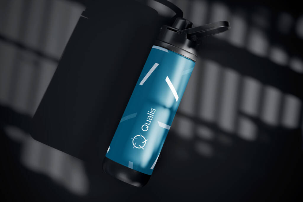
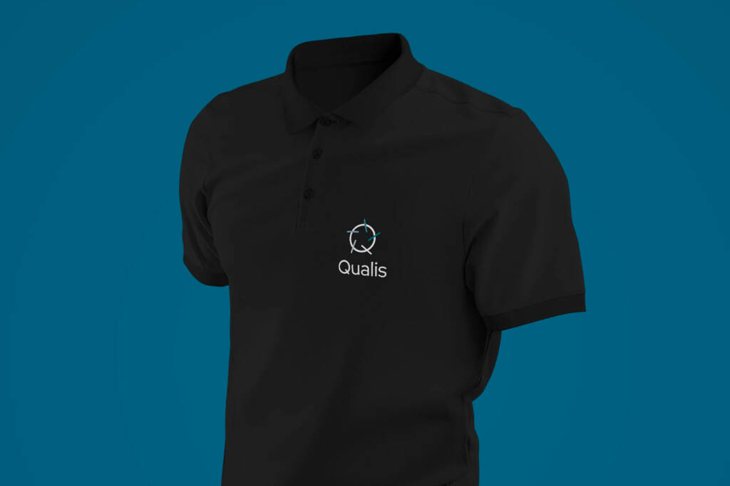
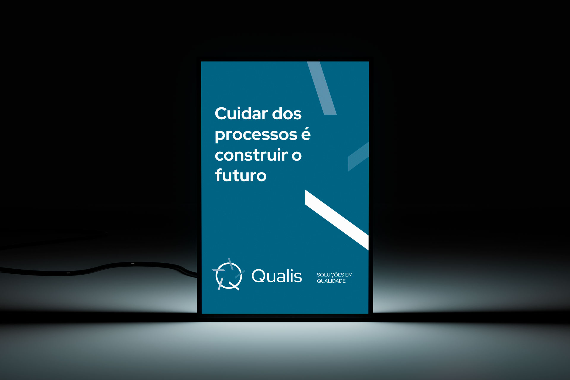
Visual identity project applied across stationery, signage, uniforms, promotional materials, advertisements, products, and social media.
Brasília, Distrito Federal
Client: Qualis
Creative direction, design, and project management Marcos Medeiros