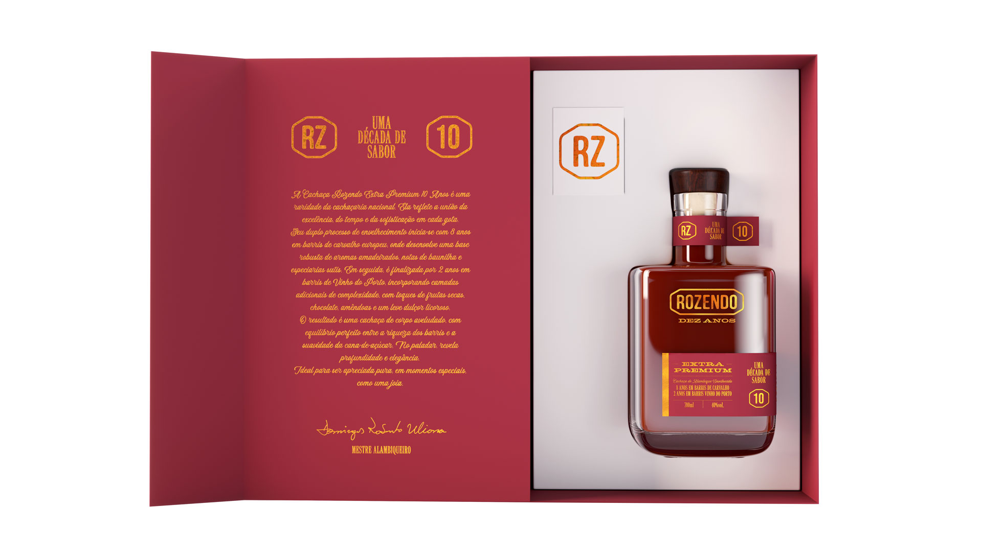
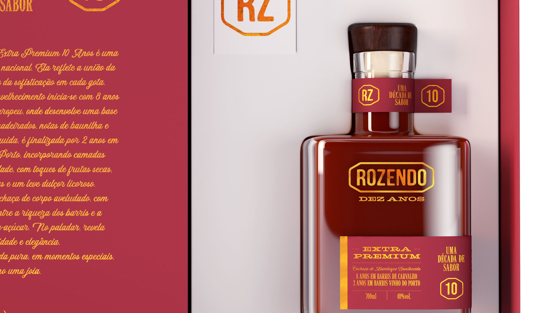
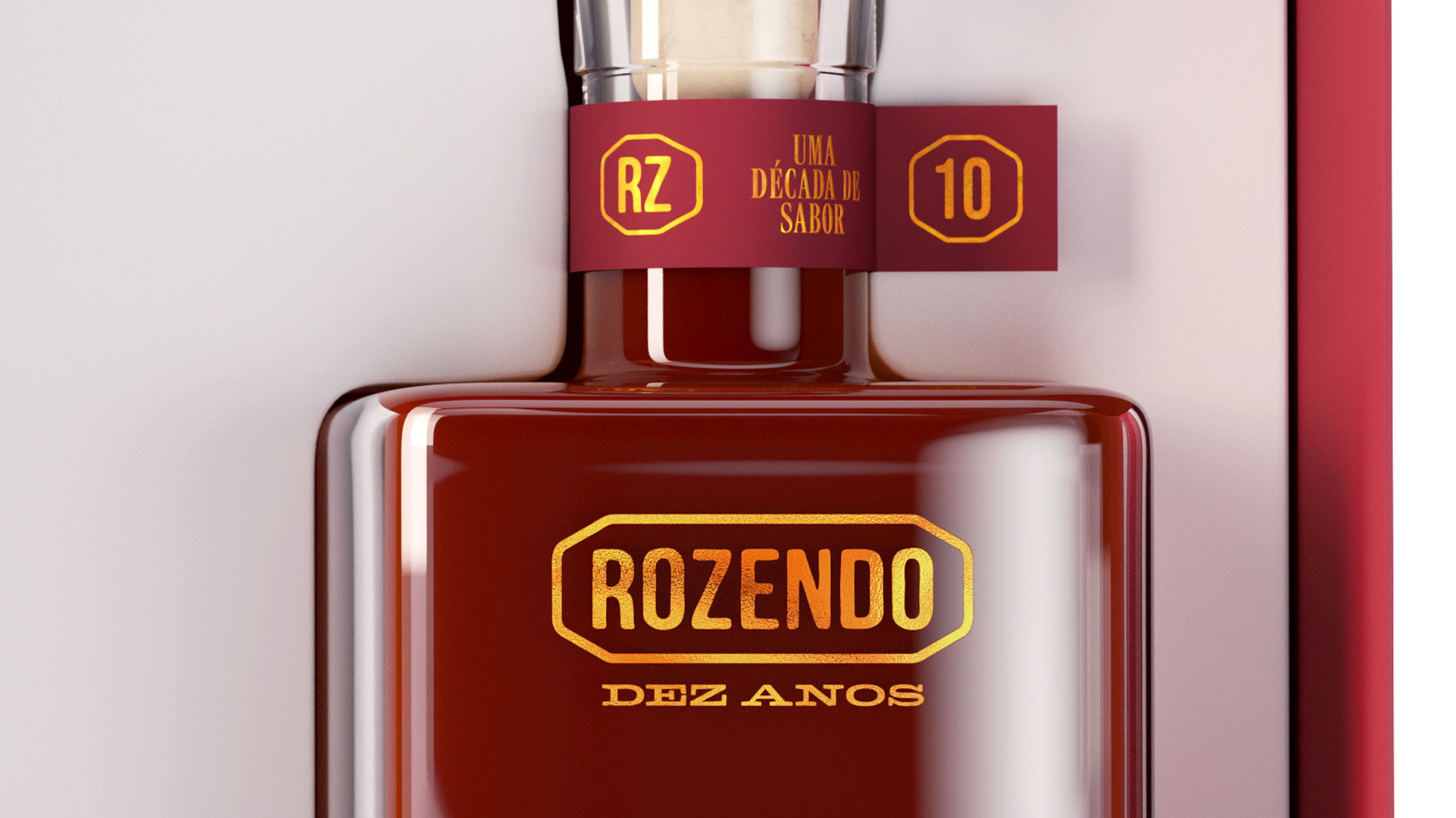
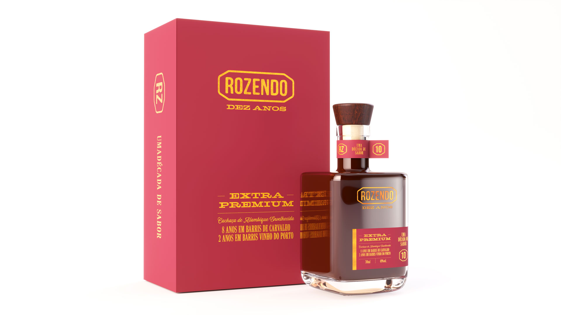
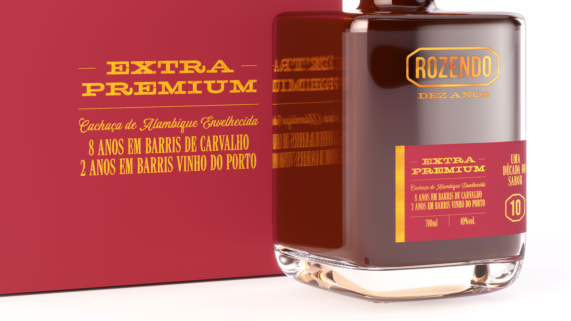
The packaging design for Cachaça Rozendo 10 Years was developed through the AgroBR program, an initiative that brings together CNA and Centro Brasil Design to strengthen the presence of Brazilian products in the market. The label’s identity was built around time and tradition: the extended typography represents the cachaça’s 10 years of aging. The asymmetrical, sash-shaped label creates standout shelf presence, allows the product’s color to show through, and reinforces its sophistication. The use of hot stamping highlights the extra-premium character of the beverage. The entire packaging was designed in compliance with industry technical regulations.
Product identity, packaging, and label design project
Coqueiral, Minas Gerais
Client: Cachaça Rozendo
Creative direction, design, and project management Marcos Medeiros 3Ds Arjuna Sá