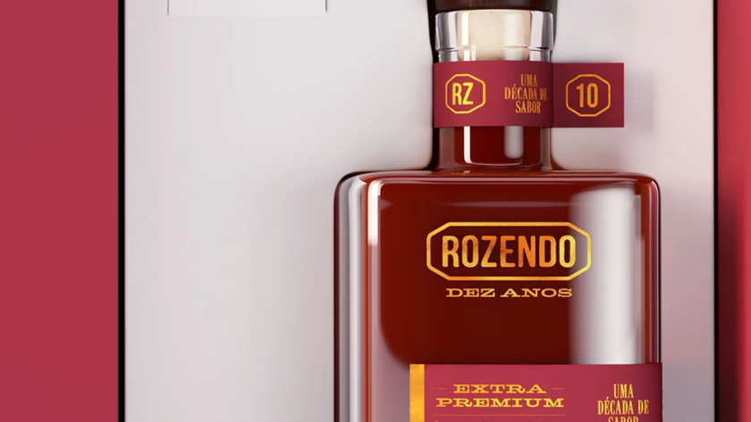
Qualis
With symbolic and strategic visual language, the Qualis brand is built from the overlapping of star-shaped lines over a circle, uniquely forming the letter "Q". This composition directly reflects the company's commitment to management and the improvement of processes and results, which is the essence of its work. The star represents the pursuit of…
Madeiras Brasileiras
The labels for the "Madeiras Brasileiras" (Brazilian Woods) line of Cachaça Rozendo were developed to highlight the product’s origin and aging process. Each label prominently features the name of the wood used in maturation, emphasizing its key role in the cachaça’s sensory profile. Illustrations showcase the texture and grain of the trees, visually…
Engelumi
With a precise and contemporary visual language, the Engelumi brand is built around the letter "E", explored as a symbol of profiles, structures, and perspectives, elements that directly reference the technical universe and the versatility of aluminum. This graphic representation reinforces the strength and constructive intelligence of the products while also suggesting innovation and…
Área BH
ÁreaBH is a creative brand that connects the emotional identity of Belo Horizonte with the concept of self-storage, where the area (base x height) is the actual product being offered. The name plays cleverly on the city's abbreviation and the formula for area, creating a direct association with the storage unit sizes. The…
