Venar
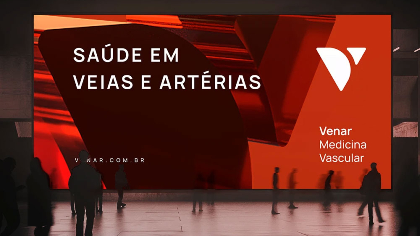
Venar is a medical clinic specializing in vascular medicine, located in Divinópolis, in the Central-West region of Minas Gerais, Brazil. The name originated from the union of the words “vein and arteries,” reflecting the clinic's comprehensive scope in circulatory system care. Short and impactful, the name conveys expertise in both specialties. The brand mark…
Tatiana Voigdlener
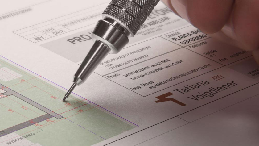
The Tatiana Voigdlener Arquitetura brand presents a clean and easily interpreted synthesis, conveying security and competence. The letter "T," the central element of the identity, reinforces the personal connection and evokes concepts such as equilibrium, structure, and form. Its design suggests an architectural structure, with vertical and horizontal lines in harmony. Diagonals introduce…
Quattri D'Oro
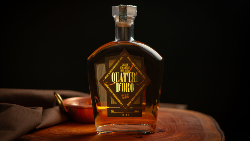
Cachaça Quattri D’Oro unites tradition, sophistication, and symbolism in a blend aged in four noble woods: Amburana, Castanheira, American Oak, and Grápia. Its diamond-shaped label refers to the "Diamonds" suit of the card deck, while the vertical, high-contrast typography evokes the universe of card games. The Four of Diamonds card, which inspires the…
Neoro
Neoro is a reference center for the treatment of cerebral and spinal diseases, comprised of a specialized neurosurgery team. The name was developed following public research, seeking a striking sound and alignment with the company's values. Neoro carries the phonetic proximity to "Neuro" and the semantic richness of "Neo" (new) + "Oro" (gold), positioning…
MammyCard
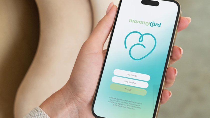
The brand stands out for its authenticity and sophistication, connecting uniquely with doctors and expectant mothers. The typographic interlock between the letters “C” and “A” subtly evokes the theme of pregnancy, making the brand clear, memorable, and modern. The symbol, created with a continuous line, integrates the letters M and C in the shape…
Cura Queijaria
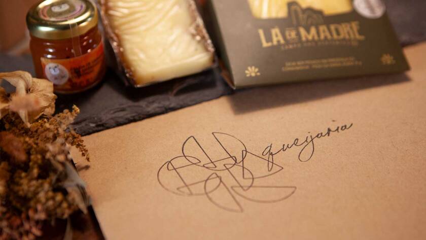
With a contemporary and disruptive language, the brand is typographically built upon the representation of cheese fractions, in a friendly play that evokes the diversity of flavors and sizes of this delicacy. This also conveys good moments of gathering when the product is served at the table. The color palette symbolizes the maturation…
Kirato
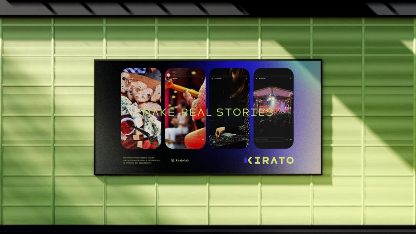
Kirato specializes in capturing and editing moments in vertical format for social media. Using only a cell phone, it transforms everyday scenes into striking visual stories that connect and remain in memory. The brand design translates this modern and accessible essence: uppercase typography, with straight lines and rounded corners, referencing the shape of mobile…
BubbleBox
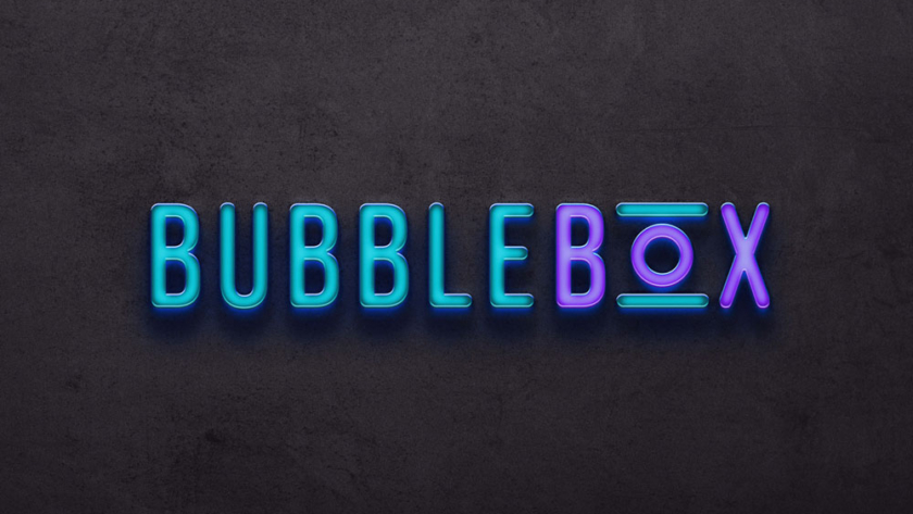
The Bubble Box brand brings a young and innovative approach to clothing care, reflecting its essence through representative visual elements. The rounded typography conveys softness and smoothness, reinforcing the idea of clean and well-cared-for clothes. The reference to front-loading washers and dryers appears in the highlighted letter “O” in the word “Box,” symbolizing practicality…
Aurus
The Aurus Medical and Aesthetic Clinic brand is the epitome of excellence. The name originates from "Aurum," which means gold in Latin. Visually, the identity features the letter A, a symbol of superior quality, fused with an olive branch, which represents recognition and references the city of Oliveira, where the clinic is located. The…
Cerveja Sambaqui
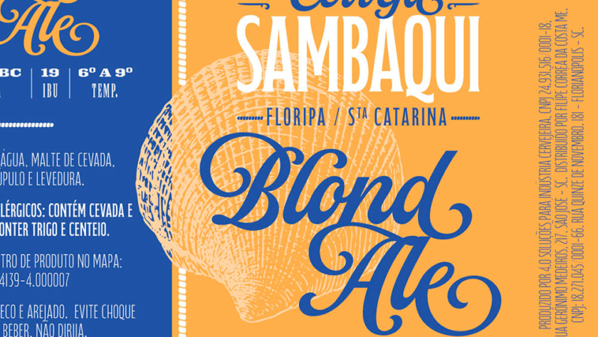
Introducing the new identity of Cerveja Sambaqui! A pioneering brand since 2013, now with a refreshed look and even more connected to its maritime essence. The iconic shell has been redesigned with new details and proportions, reinforcing its inspiration from the sea. The color palette has evolved into a lighter blue and a…
Rozendo 10 Anos
The packaging design for Cachaça Rozendo 10 Years was developed through the AgroBR program, an initiative that brings together CNA and Centro Brasil Design to strengthen the presence of Brazilian products in the market. The label’s identity was built around time and tradition: the extended typography represents the cachaça’s 10 years of…
Qualis
With symbolic and strategic visual language, the Qualis brand is built from the overlapping of star-shaped lines over a circle, uniquely forming the letter "Q". This composition directly reflects the company's commitment to management and the improvement of processes and results, which is the essence of its work. The star represents the pursuit of…